


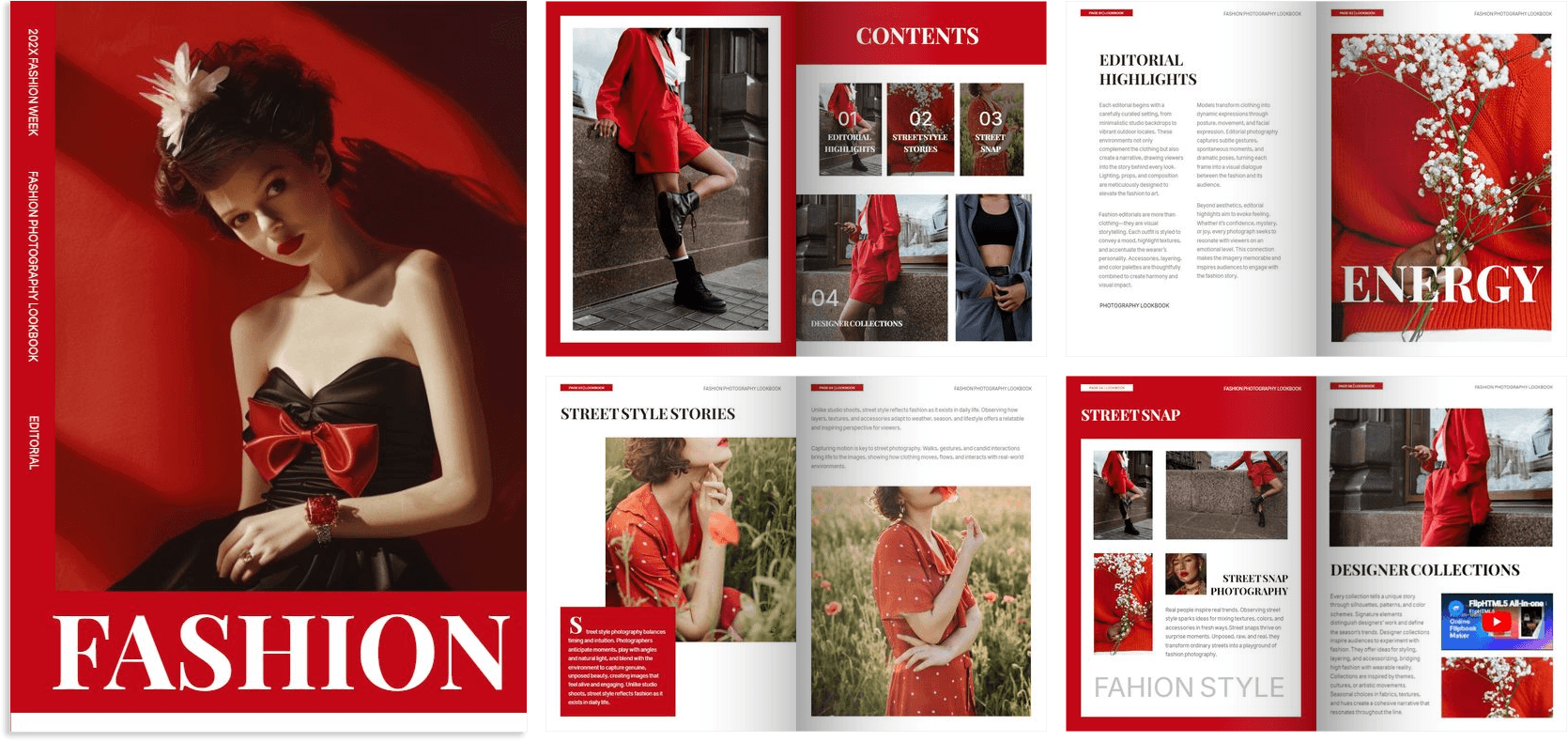
A fashion collection begins with an idea: a silhouette, a fabric, a memory or a particular way of seeing the world. Designers translate that idea into garments through sketches, fittings and countless decisions about colour, texture and construction. Yet the collection’s identity also takes shape through objects that never appear on the runway.
Invitations introduce its mood. Lookbooks explain how the pieces work together. Tags communicate details at the point of purchase, while packaging carries the experience home. Catalogues help buyers navigate the range, and campaign materials bring its imagery into public spaces.
Together, these printed materials give a collection a physical presence beyond the clothes themselves. Each has a practical job, but each also contributes to how the collection is understood and remembered.
Invitations: The First Encounter
For many guests, the invitation is their first physical encounter with a new collection. Before they see a single garment, they receive clues about the designer’s intentions through paper, typography, colour and format.
A thick, uncoated card with restrained lettering might suggest quiet confidence. A translucent envelope could introduce a collection built around layers and transparency. An unexpected fold or deliberately oversized format can create curiosity before the recipient reads the details.
The invitation must still function clearly. The date, location, arrival time and access instructions need to be easy to find. An intriguing design loses its usefulness if guests struggle to understand where they should go.
When the practical and creative elements work together, an invitation establishes expectations and becomes a small keepsake from the event.
Lookbooks: Giving the Collection a Visual Language
Individual garments reveal more when they are seen in relation to one another. A lookbook provides that context, showing how a designer combines shapes, colours, accessories and textures into complete looks.
Its printed format allows the brand to control the sequence. An opening image can establish the atmosphere, followed by a series of looks that gradually reveal the collection’s range. Close-ups can draw attention to a fastening, a fabric surface or a detail that might disappear in a full-length photograph.
Paper and reproduction quality influence the result. A glossy surface may suit sharp, saturated photography, while an uncoated stock can complement softer imagery. Both require careful testing: shadows must retain detail, and fabric colours should reproduce as faithfully as possible.
For editors and stylists, clearly numbered looks and accessible contact information make the book easier to use after the initial impression.
Tags: Small Surfaces, Important Decisions
A hangtag occupies very little space, yet it often reaches the customer at a decisive moment: when they are examining a garment and considering whether to buy it.
Its design should feel connected to the piece. A substantial textured card might complement a structured coat, while a lighter tag could suit delicate clothing. Typography, attachment methods and the amount of information all affect the impression.
The content needs careful judgment. A useful tag might explain a distinctive production technique, identify the style or provide relevant material information. Trying to fit the brand’s entire history onto it can make even an attractive design difficult to read.
Hangtags also need to work alongside sewn-in labels and other product information. Their strongest contribution is often to answer a specific question or highlight a detail the customer might otherwise overlook.
Packaging: Carrying the Experience Home
Packaging extends the collection’s identity into the period after purchase. Bags, boxes, tissue paper, stickers and printed inserts accompany the garment as it moves from a shop or delivery parcel into someone’s wardrobe.
Good packaging begins with the product’s needs. A tailored jacket requires different protection from a silk scarf or a small accessory. The structure should prevent unnecessary crushing, snagging or movement, while allowing the customer to open it easily.
Printing gives these functional elements a recognisable character. A pattern inside a box, a carefully positioned logo or a short care message can make the experience feel considered.
Consistency matters more than adding layers. Excessive wrapping can become inconvenient, particularly when materials are difficult to separate. A well-proportioned package with a few thoughtful details can communicate care through both its appearance and its usefulness.
Catalogues: Helping Buyers Make Decisions
A catalogue has a more detailed commercial role than a lookbook. It helps retailers and other buyers understand what is available and assemble an order.
That means visual clarity must be supported by accurate information. Style references, colour options, sizes and material descriptions need a consistent structure. Buyers should be able to compare related pieces without repeatedly searching through pages.
The catalogue’s organisation can also reveal the logic of the collection. Grouping garments by category, delivery period or design story helps explain how the range might work in a store.
Because commercial details can change during production, proofreading is especially important. An incorrect reference number or mismatched photograph can create confusion well beyond the printed page. A beautiful catalogue earns its place when it makes decisions easier.
Campaign Materials: Taking the Collection Outside
Campaign images travel through shop windows, posters, postcards, displays and other printed formats. These materials introduce the collection to people who may never attend a presentation or open a lookbook.
Each format demands a different approach. A window graphic must remain legible from a distance. A postcard can reward closer inspection. A large poster needs an image that retains its impact when enlarged and cropped.
Simply resizing one layout rarely produces the best result. Faces, garments, logos and text need to be positioned for the actual viewing conditions.
Print testing is particularly valuable when campaign imagery depends on subtle colour relationships. The same photograph can look different on coated paper, textured stock and display material, so the final surface should be part of the design decision.
Making Every Piece Belong
These printed objects often have different suppliers, schedules and production requirements. Without coordination, their colours, finishes and proportions can drift apart.
A shared visual system helps maintain coherence while allowing each item to serve its purpose. Physical proofs, accurate files and agreed paper choices make that system easier to carry through production.
The result is a collection people encounter through several connected experiences: receiving an invitation, turning a page, examining a tag and opening a package. Thoughtful printing gives each encounter its own value while keeping the designer’s original idea recognisable.