


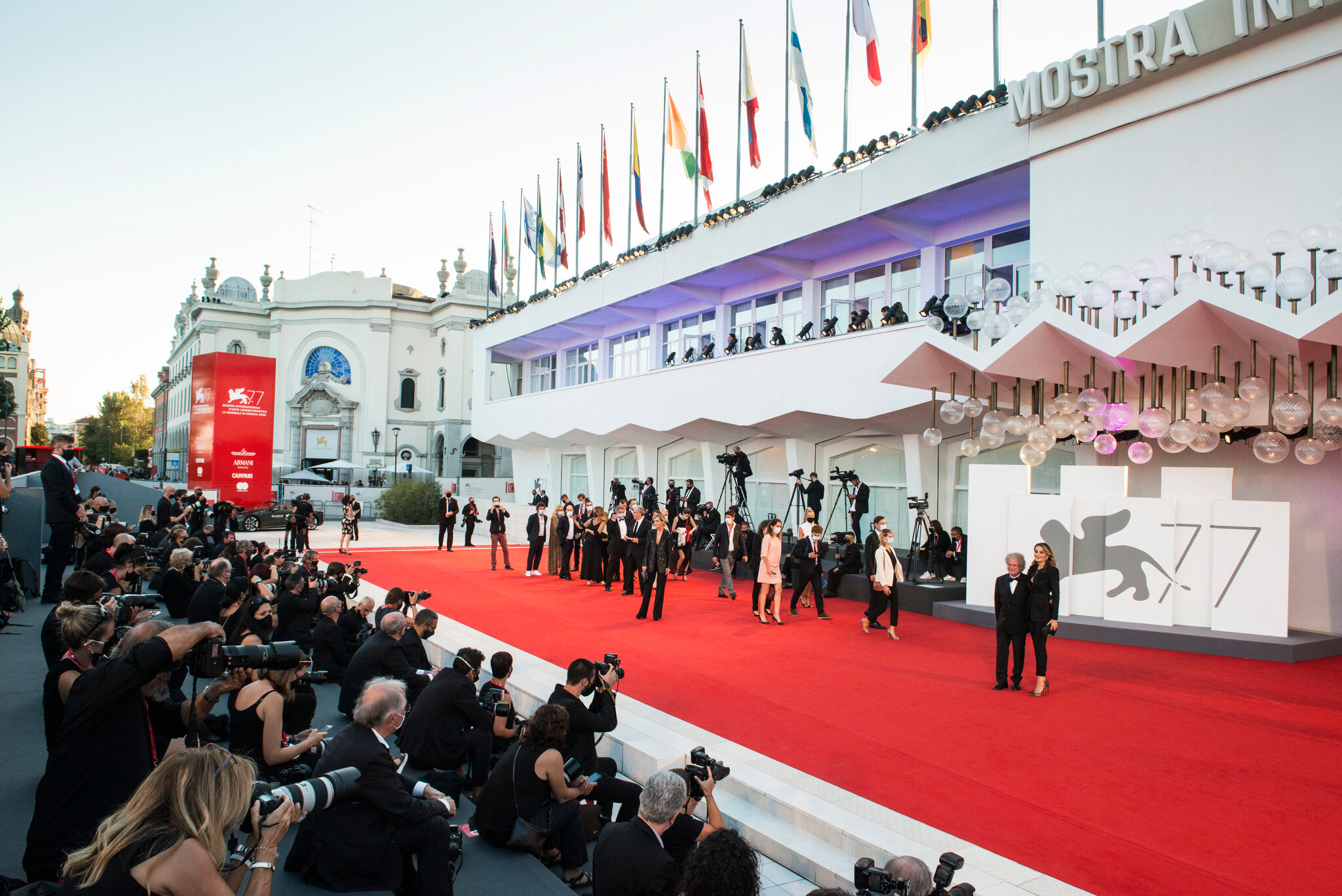
Before the first film begins, the first musician steps onstage, or the first visitor walks through an exhibition, a festival already exists on paper.
It appears in production schedules, accreditation badges, site maps, posters, programmes, backstage signs and delivery labels. Some of these materials become part of the audience’s experience. Others disappear before the doors open, having helped a team transform an empty venue into a functioning event.
While performances and screenings attract attention, printed materials quietly connect the people, spaces and activities behind them. Their preparation begins long before opening day.
Turning a Programme into Something People Can Use
A festival programme usually starts as a collection of changing information: confirmed participants, provisional schedules, venue details, project descriptions and partner requirements.
Turning that information into print requires more than arranging text attractively. Someone must check how names are spelled, whether titles need translation, which descriptions are approved and whether the same event appears at the same time across every document.
A small correction can affect several materials. Moving a screening may require updates to the programme booklet, daily schedule, venue poster and information desk handout. Changing a venue can also alter the map and directions.
This makes print production an exercise in coordination. Designers need reliable content, printers need production time, and organisers need a clear deadline after which changes become difficult or costly.
The finished booklet may look effortless. Getting it ready rarely is.
Building an Identity Across Different Surfaces
A festival’s visual identity must work beyond its main poster.
The same design language may appear on a large outdoor banner, a narrow wristband, a folded map and a small accreditation badge. Each format introduces different conditions. A poster needs to attract attention from a distance. A programme must remain comfortable to read. A badge should communicate essential information at a glance.
This requires adaptation, rather than simply shrinking or enlarging the same artwork.
Typography, colour, image placement and material choices all influence the result. A detailed illustration that looks striking on a screen may lose clarity on a small printed surface. A delicate typeface may become difficult to read under dim venue lighting.
Before production begins, the identity must be tested against the practical situations in which people will encounter it.
Making a Temporary Place Understandable
Festivals often change how familiar spaces function. A courtyard becomes a concert venue. A museum hall becomes a registration area. A cinema foyer accommodates press, guests, ticket holders and volunteers.
Printed signage helps people understand this temporary arrangement.
Visitors need to find entrances, screening rooms, toilets, accessible routes and information points. Staff need to locate storage areas, production offices and restricted zones. Drivers and suppliers may need a separate delivery entrance.
The challenge is anticipating decisions before people have to make them. A direction sign is most useful before a junction, where someone still has time to choose a route. Placing it after the turn creates confusion.
Teams often discover missing signs during a final walkthrough. What seems obvious to someone who has spent weeks preparing the venue may be unclear to a first-time visitor.
Printing Access and Responsibility
Accreditation badges and wristbands are small objects with significant operational roles.
They help distinguish artists, crew, journalists, volunteers, partners and audience members. Depending on the event, they may also indicate access to particular venues, dates or activities.
Their design needs to balance identification with readability. If a staff member must inspect every badge closely to understand it, queues can form. Clear category names and visible dates can make checks easier.
Colour can support this system, but written labels remain useful, especially in poor lighting or for people who cannot easily distinguish certain colours.
Before badges are printed, organisers also need accurate lists and a process for replacements. Late registrations and misspelled names are common enough to require a practical solution.
Equipping the People Behind the Scenes
Many essential printed materials never reach the audience.
Production teams use running orders, technical schedules, contact sheets, equipment labels and room lists. Volunteers may receive briefing documents showing their shifts, responsibilities and key locations. Backstage teams need signs identifying dressing rooms and holding areas.
These materials serve a different purpose from promotional print. Their value lies in speed and clarity.
A running order should make the next action easy to find. An equipment label should remain attached and readable during transport. A contact sheet should help someone locate the right person quickly.
Version control matters here. An outdated schedule can cause more trouble than a missing decorative element. Documents need clear dates or version numbers, and teams need to know when an earlier copy has been replaced.
Giving Partners Their Agreed Visibility
Festival print also carries commitments to sponsors, funders, venues and institutional partners.
Before production, organisers must confirm which logos appear, where they belong and how they should be reproduced. Partners may have requirements concerning minimum size, background colour or spacing.
Managing these details across multiple formats takes care. A logo arrangement that works on a large banner may become unreadable on a small flyer.
Approval is therefore part of the production schedule. Missing files, outdated logos and late requests can delay printing, particularly when several organisations must review the artwork.
A carefully maintained list of required acknowledgements helps prevent omissions and keeps the visual hierarchy consistent.
Choosing What Actually Needs Printing
Preparing a festival does not mean printing everything in large quantities.
Each item should have a clear purpose. Will visitors need to carry it? Does it help them navigate? Is the information likely to change? Could a durable sign serve several editions?
Frequently updated details may work better online, while essential directions still benefit from being visible without a phone. A concise printed schedule can be useful even when a fuller programme is available digitally.
Quantity matters too. Attendance estimates, distribution plans and previous experience can guide print runs. Materials should be allocated to specific locations, rather than ordered without a clear plan for their use.
The Final Check Before Opening
Once printing is complete, the work shifts to delivery, sorting, installation and inspection.
Boxes must reach the correct venues. Programmes need to be placed at entrances. Badges must be organised for collection. Signs need secure mounting and clear sightlines.
Then comes the final walkthrough: checking routes, reading signs from a visitor’s position and confirming that printed schedules match the latest approved programme.
By the time the audience arrives, most of these decisions are invisible. People collect a booklet, find their venue and take their seats. That apparent simplicity is the result of weeks of preparation—and a considerable amount of carefully planned print.