


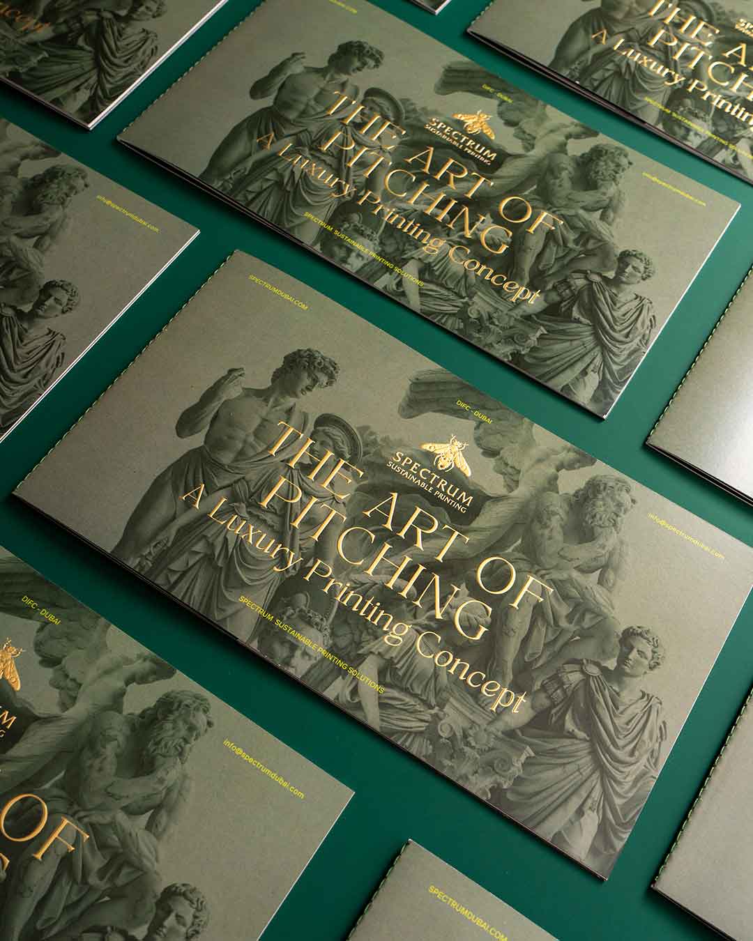
Why does one business card feel like it belongs to an international luxury brand, while another — printed on almost the same budget — looks ordinary? Why can a simple invitation feel exclusive, while a much more expensive brochure somehow looks cheap?
The answer is not always the price of the paper, the number of colors used, or how many special finishing techniques were ordered from the printer.
Sometimes, expensive-looking print is simply well considered.
We have learned to associate certain visual and tactile signals with quality. A generous margin, an unusually thick sheet, a restrained color palette, carefully chosen typography, precise alignment, or a small detail in the finishing can completely change how we perceive a printed object.
And the interesting part is that many of these effects don’t necessarily require a huge budget.
Luxury is often about restraint
One of the most powerful characteristics of expensive-looking design is that it doesn’t seem to be trying too hard.
Luxury brands rarely need to fill every available space with information. Their packaging, stationery, catalogs and invitations often leave room for silence. A logo might sit alone on a large sheet. A short sentence may occupy an entire page. A photograph might be surrounded by generous white space.
This creates a feeling of confidence.
Cheap-looking design often communicates urgency: Look at everything we have to offer. Don’t miss anything. Read this. Notice that. Here’s another promotion.
Premium design communicates the opposite: We don’t need to fill the space.
The surprising thing is that white space costs nothing.
A printer charges for paper, ink and production. It doesn’t charge extra for leaving part of the page empty. Yet the decision to use that empty space intelligently can make an inexpensive printed object feel dramatically more valuable.
Paper matters — but not always in the way you think
Paper is one of the first things we associate with quality.
When we touch a thick invitation or a beautifully textured business card, we immediately notice the difference. Weight, softness, texture and even the sound of a sheet being handled can influence our perception.
But expensive-looking print doesn’t always require the most expensive paper available.
The key is appropriateness.
A simple uncoated paper can feel sophisticated when paired with elegant typography and a thoughtful layout. A warm, slightly textured stock can create more character than an extremely expensive glossy paper. Sometimes a modest paper chosen specifically for the concept feels more premium than a luxury stock used without purpose.
The important question isn’t simply, “How expensive is this paper?”
It’s “Does this paper feel intentional?”
That distinction is crucial.
Typography can create value before you touch the object
Typography is another major contributor to perceived quality.
Certain typefaces have associations with editorial publishing, fashion, architecture, finance or luxury. But simply choosing a “luxury-looking” font isn’t enough.
Expensive-looking typography is usually about relationships: the distance between letters, the size of headings, the length of lines, the hierarchy between different pieces of information and the amount of space surrounding text.
A beautifully designed page can use only one typeface and still feel sophisticated.
In fact, limiting the number of fonts can often make a printed object feel more expensive.
There is something psychologically reassuring about consistency. When every element appears to belong to the same visual system, we interpret that coherence as evidence of care.
And care is one of the strongest ingredients of perceived value.
The power of one special detail
Here’s where things become particularly interesting for print production.
You don’t necessarily need five different finishing techniques to make something memorable. Sometimes one detail is enough.
A small embossed logo.
A subtle foil line.
A textured cover.
A die-cut edge.
A different paper for the inside pages.
A spot of varnish used in exactly the right place.
A colored edge.
The secret is not to demonstrate everything the printing technology can do. It is to choose one detail that supports the concept.
When special finishing is everywhere, it can start to feel decorative. When it appears once — exactly where the viewer expects it — it feels intentional.
And intentionality often reads as luxury.
Color can make a cheap print feel expensive
Color is another area where restraint can outperform budget.
A sophisticated palette might contain only black, white and one carefully selected accent color. Meanwhile, an inexpensive-looking design can contain dozens of competing colors.
This doesn’t mean colorful design is inherently cheap. It means that color needs hierarchy.
Deep neutrals, muted tones, carefully selected metallics and subtle contrasts have long been associated with premium aesthetics. But even bright colors can look sophisticated when they are controlled.
A particularly interesting trick is to use a color not because it is visually exciting, but because it creates recognition.
Imagine a small publication printed almost entirely in black and white, with one specific shade appearing only on the cover, section dividers and a few details.
The color becomes part of the object’s identity.
You don’t need ten colors when one memorable color can do the job of ten.
Precision is invisible — until it isn’t
Some of the most important qualities of expensive-looking print are things people don’t consciously notice.
Registration.
Margins.
Alignment.
Consistent spacing.
Clean trimming.
Correct folding.
Sharp images.
Balanced proportions.
When everything is correct, the viewer may never think about it.
But when something is slightly wrong, the entire object can suddenly feel cheap.
A logo sitting two millimeters too close to an edge. A fold passing directly through text. Uneven margins. A photograph that looks slightly pixelated. A cover whose front and back don’t align properly.
These are small technical details, but they affect trust.
Our brains are remarkably good at detecting visual disorder even when we cannot explain what feels wrong.
Precision, therefore, becomes a form of invisible luxury.
Expensive-looking doesn’t mean complicated
There is a persistent misconception that premium printing needs to be complicated.
It doesn’t.
Some of the most sophisticated printed objects are incredibly simple.
A single-color invitation on beautiful paper.
A monochrome book cover with excellent typography.
A minimalist business card with one embossed element.
A small brochure using only two paper stocks.
A packaging sleeve with a perfectly positioned logo.
Their sophistication comes from decisions rather than excess.
This is good news for brands working with limited budgets. You don’t necessarily have to compete with luxury brands by spending more. You can compete by editing better.
Instead of asking, “What else can we add?” ask:
“What can we remove?”
Instead of adding another finishing technique, perhaps the paper should change.
Instead of using four fonts, perhaps one is enough.
Instead of printing a complicated image, perhaps a stronger photograph and more empty space would work better.
The budget doesn’t always determine how premium something feels. The quality of the decisions does.
The psychology behind the illusion
Why does all of this work?
Because we rarely evaluate quality objectively.
When we see a beautifully designed object, we don’t calculate the actual production cost. We make a quick judgment based on signals.
Thicker paper suggests durability.
Precise typography suggests expertise.
Minimalism suggests confidence.
Texture suggests craftsmanship.
Consistency suggests professionalism.
A carefully produced package suggests that the product inside has also been carefully considered.
This is why packaging can influence our expectations before we have even experienced the product.
The printed object becomes a promise.
And sometimes, that promise is worth more than the physical materials themselves.
The most expensive-looking thing might be attention
Ultimately, what makes a printed object feel expensive is rarely a single technical trick.
It is attention.
Someone thought about how the paper feels.
Someone adjusted the spacing between letters.
Someone decided that the logo didn’t need to be larger.
Someone tested how the colors changed on the actual stock.
Someone noticed that the fold was slightly wrong.
Someone chose not to add another element.
That accumulated attention becomes visible — and tangible — in the final object.
This is why two printed objects produced for similar amounts of money can have completely different perceived values.
One looks like something that was manufactured.
The other looks like something that was made.
And perhaps that is the real secret behind expensive-looking print.
Luxury isn’t necessarily about using more.
It is about making every detail feel as though it had a reason to exist.