


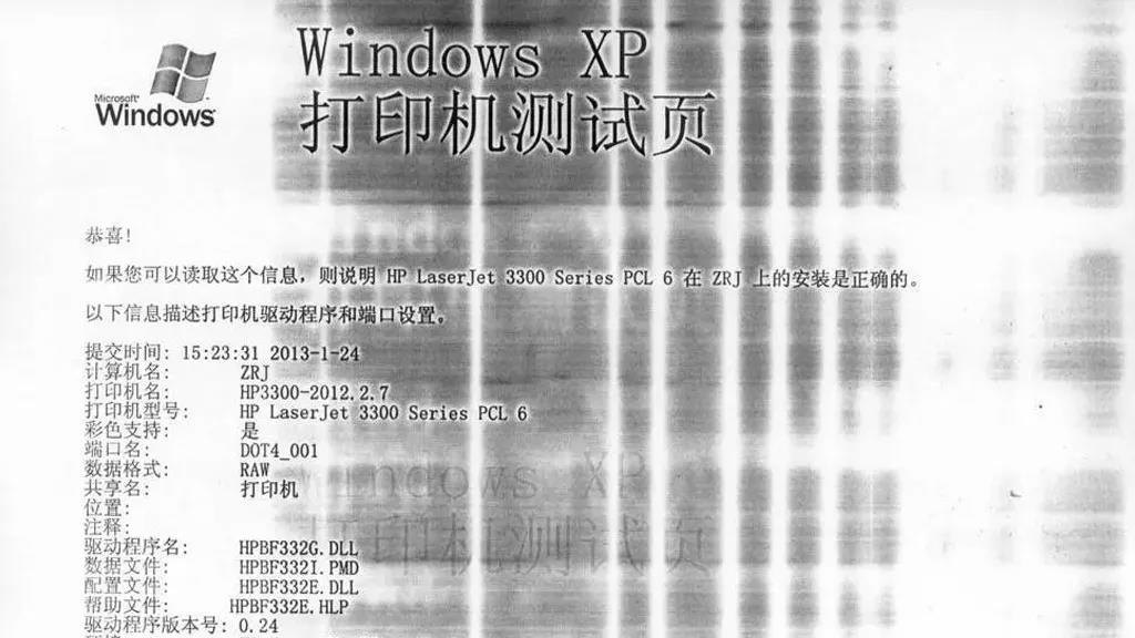
How production can completely change the designer’s original idea
A great design can take days, weeks, or even months to create. Designers choose every color, typeface, image, line, texture, and spacing with intention. They adjust margins by millimeters, compare dozens of shades, test different compositions, and obsess over details most people will never consciously notice.
And then the design goes to print.
Suddenly, the carefully selected color looks completely different. The tiny text is difficult to read. The photographs lose their depth. A beautiful dark blue becomes almost black. Fine lines disappear. The paper feels wrong. The luxurious minimalist design that looked perfect on screen suddenly looks cheap.
The problem isn’t necessarily the design.
Sometimes, it’s the printing.
Design doesn’t end when the file is finished
One of the biggest misconceptions about graphic design is that the designer’s work ends when the final PDF is delivered.
In reality, a design intended for physical production is only half the story.
A digital file exists in a controlled environment: a screen with its own brightness, color profile, contrast, and resolution. Printing introduces an entirely different set of variables.
Ink or toner replaces pixels. Paper replaces a glowing screen. Finishing processes add another layer of transformation. Cutting, folding, binding, laminating, embossing, or varnishing can all affect the final result.
A design that looks perfect digitally can therefore produce a disappointing physical object if production isn’t considered from the beginning.
This is why the relationship between designer and printer matters so much.
The color problem
Color is probably the most obvious example of how production can change a design.
On a screen, colors are generally created using RGB — red, green, and blue light. Printing usually relies on CMYK — cyan, magenta, yellow, and black inks. These systems don’t reproduce color in exactly the same way.
That brilliant neon green on a monitor may not be achievable with standard printing inks. A subtle gradient may lose some of its smoothness. A rich black background may print flatter than expected.
Even colors that appear simple can behave unpredictably.
And then there is paper.
The same ink can look dramatically different on coated glossy paper, uncoated paper, recycled stock, textured paper, or colored paper. A warm cream-colored sheet can change the appearance of whites and pastels. An absorbent uncoated paper can make colors look softer and less saturated.
This means that choosing a color without considering the printing process is a little like designing an interior without knowing what materials will be used to build it.
When black isn’t just black
Black deserves special attention.
Designers sometimes use a simple 100% black for large areas, assuming it will produce a deep, powerful background. Depending on the printing process and substrate, however, the result can look less rich than expected.
For certain applications, printers may recommend a “rich black” — a carefully balanced combination of inks that produces a deeper visual effect.
But adding more ink isn’t automatically better.
Too much ink can create problems with drying, registration, smudging, or paper handling. The correct solution depends on the printing technology, paper, and project.
This is a perfect example of why production knowledge should be part of the design conversation.
Tiny details don’t always survive
Digital design allows us to zoom in endlessly.
Print doesn’t.
A one-pixel line on a screen might look perfectly visible when viewed at 400% zoom. Once printed, it may become barely visible or disappear entirely.
The same applies to extremely small typography, delicate patterns, thin borders, and intricate illustrations.
A designer may intentionally create something subtle — and that subtlety may be exactly what makes the design beautiful. But printing requires understanding the physical limitations of the chosen process.
There is a difference between delicate and unprintable.
Good production turns the former into reality without accidentally creating the latter.
Images can lose their impact
Photography is another area where production can dramatically alter the original concept.
A photograph displayed on a high-quality screen can have extraordinary depth, contrast, and detail. Printed on the wrong paper or with inappropriate settings, that same image may appear dull, muddy, overly dark, or lacking in detail.
Resolution matters too.
An image that looks acceptable on a phone may not contain enough information for a large-format print. Enlarging it can reveal pixelation and artifacts that weren’t visible at smaller sizes.
Color management, image resolution, file preparation, paper selection, and printing technology all contribute to the final result.
In other words, the printer isn’t simply “pressing print.”
The production process is interpreting the designer’s visual language.
Finishing can make or break the concept
Printing itself is only one stage.
What happens afterward can completely transform the object.
A matte laminate can give packaging a sophisticated, tactile appearance. Gloss can make colors feel brighter. Spot UV can highlight specific elements. Embossing can turn a flat surface into something physical and memorable. Foil stamping can introduce metallic details that immediately change the character of a design.
But finishing can also go wrong.
An emboss may be too shallow to notice. Foil may not register correctly. Lamination can change the perceived color. A folding line can cross an important design element. Poor cutting can create uneven margins.
In a physical object, production mistakes aren’t hidden behind a screen. You can see them, touch them, and sometimes feel them immediately.
The paper is part of the design
Paper is often treated as a technical specification rather than a creative decision.
That is a mistake.
Paper has color, weight, texture, opacity, brightness, absorbency, and tactile character. It influences how a publication feels before the reader even begins reading it.
Imagine a premium fashion catalogue printed on thin, highly absorbent paper. Or a children’s picture book printed on stock that makes colors appear dull. Or an elegant invitation whose paper feels completely disconnected from its visual identity.
The design may be excellent.
The object isn’t.
The physical material is part of the visual experience.
The most expensive mistake: skipping the proof
One of the simplest ways to prevent production surprises is also one of the most frequently underestimated: proofing.
A digital proof can reveal technical problems, but a physical proof can reveal something much more important — how the design actually behaves as an object.
Does the color feel right?
Is the text readable?
Does the photograph have enough contrast?
Does the paper support the concept?
Does the finish look as expected?
Does the folded piece align correctly?
A proof isn’t simply an administrative step before mass production. It is the moment when the digital idea meets the physical world.
For expensive projects, that meeting can save enormous amounts of money.
Great printing is invisible
The best printing often doesn’t call attention to itself.
You don’t look at a beautifully produced book and think, “Excellent color registration.”
You simply think the book looks beautiful.
You don’t notice that the paper was carefully selected or that the black was technically optimized. You experience the result as a coherent object.
That is the real goal of production: not to compete with the designer’s idea, but to make that idea tangible.
When printing is done badly, production becomes visible. It interrupts the experience and reminds us that something went wrong between concept and reality.
When printing is done well, that gap disappears.
The designer and printer should speak the same language
The strongest printed projects usually happen when designers and printers collaborate early.
Instead of asking, “Can you print this file?” at the end of the process, it is much more productive to ask, “How can we produce this idea?”
That conversation can influence paper selection, color choices, typography, image preparation, finishing, binding, format, and even the original design.
Sometimes the printer may suggest a different paper that makes the colors work better. Sometimes a designer may adjust a tiny detail to make sure it survives production. Sometimes a limitation can become a creative opportunity.
Great design deserves great production.
Because ultimately, a printed object isn’t just a digital design transferred onto paper. It is the result of dozens of decisions — and every one of them can change how the original idea is experienced.
The difference between a disappointing print and an exceptional one may be invisible in the original PDF.
But once the object is in your hands, you’ll know.