


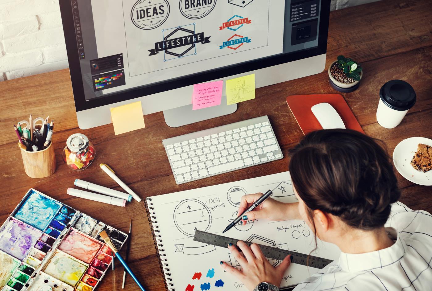
A designer can spend hours choosing the perfect color, adjusting a line by a fraction of a millimeter, comparing typefaces, and staring at a screen until every detail feels exactly right.
Then the file goes to print.
And suddenly, things change.
The blue that looked rich and luminous on the monitor appears darker on paper. The subtle gray disappears. The tiny typeface that seemed perfectly elegant becomes difficult to read. A photograph loses some of its depth. A carefully chosen gradient behaves differently. And the beautiful white space the designer created turns out to be influenced by the very material it sits on.
This is the moment when design leaves the screen and enters the physical world.
The screen is not paper
The first thing a designer encounters when moving from digital design to print is a fundamental difference: screens create images with light, while printing creates images with ink or toner.
A screen can produce millions of colors by emitting red, green, and blue light. This is the RGB color model. Printed materials generally rely on CMYK — cyan, magenta, yellow, and black — where colors are created through layers of ink.
That means a color that exists beautifully on a screen may not have a direct equivalent in print.
The glowing intensity of an electric blue, the neon quality of a vivid green, or the brightness of a particular pink can be difficult or impossible to reproduce exactly with conventional printing inks.
This is not necessarily a mistake.
It is a translation.
The designer’s job is partly to understand how the visual language of a screen will be translated into the physical language of paper.
Color becomes material
On a screen, color appears independent of its surroundings. On paper, it becomes part of a material.
The same ink can look completely different depending on the paper it is printed on.
A bright white coated paper may make colors appear crisp and saturated. An uncoated paper can absorb ink and create a softer, more tactile appearance. A warm-toned paper can subtly change the character of an entire color palette.
This is why experienced designers don’t think about color only as a digital value.
They think about what the color will become.
A designer might select a particular beige because it looks sophisticated on screen. But once printed on warm, uncoated stock, that beige may become almost invisible. A deep black might look elegant on one paper and heavy on another.
Printing forces designers to think beyond pixels.
Black has its own personality
Few things demonstrate the difference between screen and print better than black.
On a screen, black is simply the absence of light. In print, black is an ink — and even black can be constructed in different ways.
A design may use a simple 100% black, particularly for text. But large areas of black can sometimes be printed using a combination of CMYK inks to create a deeper, richer appearance.
The choice matters.
Too much ink can create problems with drying, smudging, or paper behavior. Too little can make large areas appear flat.
So when a designer prepares a poster, book cover, brochure, or packaging, “black” is not necessarily one decision. It can be a technical and aesthetic choice.
The screen hides that complexity.
The printing press reveals it.
Resolution stops being theoretical
Digital design makes resolution feel almost abstract. A designer can zoom in endlessly, inspect individual pixels, and work with extremely detailed images.
Print has physical limitations.
Images need sufficient resolution to reproduce clearly at their intended size. A photograph that looks perfect when viewed on a laptop might appear soft or pixelated when enlarged onto a poster.
This is why print design requires designers to think about the final physical dimensions of an image, not simply how it looks inside a design program.
The question changes from:
“Does this look sharp on my screen?”
to:
“Will this still look sharp when someone holds it in their hands?”
That is a completely different way of thinking.
The edge of the page matters
There is another concept that often surprises people who primarily work digitally: bleed.
A design intended to extend all the way to the edge of a printed page cannot simply stop exactly at the edge of the document. The artwork usually needs to extend beyond the final trim line.
Why?
Because paper is physically cut. Even highly precise industrial cutting has tolerances. The extra area — the bleed — ensures that tiny variations don’t leave unwanted white strips along the edge.
On a screen, there is no cutting.
On a printing press, there is.
This is one of the clearest examples of how physical production changes the way designers think.
Typography meets reality
Typography also behaves differently in print.
On a high-resolution screen, tiny type can appear remarkably sharp. On paper, especially absorbent paper, small details can soften.
The choice of typeface, weight, size, spacing, and line height suddenly has physical consequences.
A very thin font may lose some of its delicacy. Small reversed-out text — white text printed inside a dark area — can become less legible than expected. Tight letter spacing can become visually crowded.
Good print typography therefore isn’t only about aesthetics.
It is about physical readability.
The designer needs to understand how ink, paper, size, and reproduction interact.
Finishing adds another dimension
Then comes something the screen cannot simulate perfectly: finishing.
A printed piece can be embossed, debossed, foiled, laminated, die-cut, varnished, folded, perforated, or bound.
These processes add depth and texture.
A logo can become something you can feel with your fingertips. A metallic detail can catch the light differently as you move the object. A matte finish can change the way colors are perceived.
This is where printing stops being simply a method of reproducing a design.
It becomes part of the design itself.
The designer is no longer working only with color, typography, images, and composition. They are working with texture, weight, reflection, thickness, and movement.
The proof changes everything
One of the most valuable moments in the printing process is the proof.
A proof gives the designer an opportunity to see a physical approximation of what has been created digitally.
And sometimes the reaction is:
“This isn’t what I expected.”
That’s not necessarily bad.
It is information.
The proof reveals things that a monitor cannot: how the paper absorbs the ink, how the colors interact with the surface, whether the type feels large enough, whether the black is too heavy, whether the contrast works, and whether the overall object feels the way it was intended to feel.
Printing creates a feedback loop between design and reality.
Designers learn to design for the press
The best print designers eventually develop a kind of sixth sense.
They begin to anticipate how a color will behave. They know that certain papers soften images. They understand when a thin line is too thin. They know when a particular black will work better. They leave enough bleed. They consider binding before finishing the layout.
Most importantly, they stop treating the printing press as something that happens after design.
Instead, printing becomes part of the design process from the beginning.
The press is not simply the machine that reproduces the designer’s work.
It is one of the tools through which the work becomes real.
From pixels to something you can hold
There is something almost magical about watching a digital file become a physical object.
On the screen, a design can be duplicated infinitely. It can be resized, moved, undone, revised, and deleted with a click.
A printed object has a different kind of existence.
It has weight.
It has texture.
It occupies space.
It can be folded, touched, collected, displayed, passed from one person to another, and eventually become part of someone’s physical memory.
That is what happens when a designer’s screen meets a printing press.
The design stops being only an image.
It becomes an object.
And in that transformation — between pixels and paper, RGB and CMYK, light and ink, precision and physicality — some of the most interesting parts of graphic design begin to happen.