


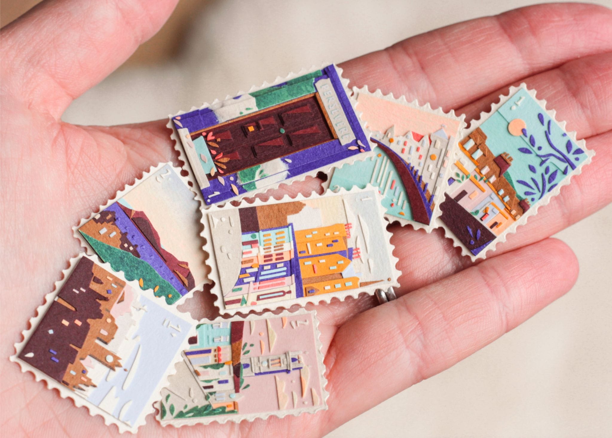
In design, one millimeter sounds insignificant.
It is smaller than a fingernail. You probably would not notice it on a ruler. On a computer screen, a one-millimeter difference can feel almost meaningless.
But in print, one millimeter can be the difference between something looking perfectly balanced and something feeling strangely wrong.
A margin can become too narrow. A photograph can shift away from the visual center. A logo can suddenly feel crowded. A folding line can cut through an important element. A box can stop looking symmetrical. A book cover can lose the breathing room that made the original design feel elegant.
This is the 1-millimeter problem: the reality that tiny production decisions can have disproportionately large effects on the finished object.
Design Exists in Measurements
Digital design encourages us to think in pixels, grids and percentages. Production introduces another world: millimeters, tolerances, paper thickness, cutting accuracy, folding positions, spine widths and material behavior.
A designer may create a beautiful layout with everything positioned exactly where it should be. But the printed piece does not exist inside a perfectly controlled digital environment.
Paper moves.
Ink behaves differently depending on the stock.
Cutting has tolerances.
Folding is never infinitely precise.
Binding changes dimensions.
Finishing processes add their own variables.
The final object is therefore not simply a physical version of the digital file. It is the result of dozens of small decisions interacting with one another.
And sometimes, the smallest decisions are the ones that matter most.
When a Margin Changes Everything
Consider a book cover.
The designer creates a generous 20-millimeter margin around the title. It feels calm and sophisticated. The typography has space to breathe.
During production, a slight adjustment is made to the cutting position. Perhaps the final trim shifts by a millimeter.
Technically, nothing is wrong. The book is still within normal production tolerance.
Visually, however, the relationship between the title and the edge has changed.
That tiny difference becomes particularly noticeable when the same distance appears elsewhere in the design. The human eye is extremely sensitive to alignment and proportion. We may not consciously identify the problem, but we can sense that something feels “off.”
This is why precision in print is not simply about avoiding mistakes. It is about protecting relationships between elements.
The Fold Is Not Just a Line
Folding is another perfect example.
Imagine a brochure designed with three equal panels. On screen, everything looks symmetrical. Each panel is carefully measured.
But paper has physical thickness. When folded, the inner panel may need to be slightly narrower than the outer panels. If it is not, the brochure may bulge, catch on the fold or refuse to close neatly.
The designer may have created three mathematically equal rectangles.
The printer needs to create three physically functional panels.
Those are not always the same thing.
A millimeter—or sometimes even less—can determine whether the brochure feels professionally engineered or awkwardly assembled.
The lesson is important: print design is not only visual design. It is physical design.
Paper Has a Personality
One of the biggest mistakes in production is treating paper as a passive surface.
It is not.
Different papers respond differently to cutting, folding, scoring, creasing, embossing and ink. Thickness affects the final dimensions of a folded or bound product. Texture affects how colors appear. Absorption changes contrast and sharpness.
Even the direction of the paper fibers can influence how a sheet behaves.
This means that a design that works beautifully on one stock may require adjustments when printed on another.
A few millimeters added to a spine, a slightly different fold position or an adjusted image area may seem like production details. In reality, they are part of the design itself.
The Spine Is a Mathematical Problem
Book production makes small measurements particularly visible.
The spine width depends on several factors: the number of pages, paper thickness, cover material and binding method. A difference that seems tiny on an individual page becomes significant when hundreds of pages are gathered together.
Imagine designing a cover where the title sits close to the spine.
If the calculated spine width is slightly wrong, the title may no longer sit where it was intended. The front cover can appear narrower, the back cover can shift, and the overall composition can lose its symmetry.
The designer sees a cover.
The production team sees a three-dimensional object.
Good printing happens when both perspectives meet.
Color Can Create a 1-Millimeter Illusion
Not every production problem is literally about measurement.
Sometimes a tiny physical shift becomes much more visible because of color.
When two strongly contrasting areas meet, even a very small registration difference can create a visible edge. In detailed printing, fine lines, small text and overlapping colors can expose imperfections that would be invisible in a less demanding design.
This is particularly important with small typography.
A tiny shift may turn crisp lettering into something that looks slightly blurred or heavier than intended.
Again, the difference may be technically minimal.
The visual impact is not.
Finishing Makes Precision Even More Important
Special finishing techniques can make printed objects extraordinary—but they also increase the importance of accuracy.
Foil stamping, embossing, debossing, die-cutting, spot UV and other techniques introduce additional production stages.
Imagine a package with a small embossed logo positioned over a printed illustration. If the finishing position moves slightly, the relationship between the two elements changes.
The logo may no longer sit exactly where the designer intended.
On a complex design, this might barely be noticed.
On a minimalist design, it can become the first thing you see.
The fewer elements a design contains, the more important every millimeter becomes.
Minimalism Leaves Nowhere to Hide
This is one reason minimalist packaging and editorial design can actually be more difficult to produce.
A busy design contains many visual elements. Small imperfections can disappear among them.
Minimalism removes that camouflage.
A single line, a small logo, a block of typography and a large amount of empty space create a situation where every relationship is exposed.
Move something by one millimeter and the eye may immediately notice.
This is why premium-looking print often feels so precise. Luxury is not necessarily created by expensive materials alone. It is often created through control: consistent spacing, accurate alignment, clean edges and carefully considered proportions.
The Best Production Decisions Happen Before Printing
The solution to the 1-millimeter problem is not simply “be more careful.”
It is to involve production thinking early.
A designer should understand how the piece will be cut, folded, bound, laminated or finished before the final artwork is prepared.
Printers should understand what the designer is trying to achieve visually.
Prepress specialists should be able to identify potential problems before the file reaches the machine.
And everyone involved should understand which measurements are flexible and which are critical.
A one-millimeter tolerance may be completely acceptable in one area and disastrous in another.
That distinction comes from experience.
Small Decisions, Big Results
Great printed objects rarely come from one spectacular decision.
They come from hundreds of small ones.
The exact paper.
The position of a fold.
The width of a margin.
The depth of an emboss.
The placement of a crop mark.
The relationship between the text and the edge.
The thickness of a spine.
The precision of a cut.
Individually, these decisions may seem almost invisible. Together, they determine how the finished object feels in the hand and how it looks on the shelf.
That is the strange power of one millimeter.
It reminds us that print is an art of proportion and precision. What appears to be a tiny technical adjustment can change the balance of an entire composition.
Because once a design leaves the screen, every measurement becomes physical.
And in the physical world, one millimeter is never just one millimeter.