


Run a finger across a letterpress invitation and the letters may reveal themselves before you read them. The paper gives way slightly beneath the ink. Turn the card towards the light, and small shadows appear around the words. Something as ordinary as a name or a date becomes a physical presence.
That encounter helps explain why a printing process largely displaced from everyday commercial production still holds such appeal. Letterpress asks people to notice the surface carrying the message. For designers who spend much of their working lives arranging pixels, that surface offers another way to think.
When letters were objects
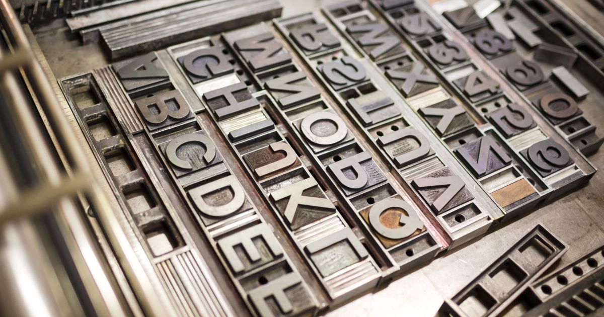
Letterpress is a form of relief printing: ink is applied to a raised surface, which is pressed against paper. Traditionally, printers assembled individual pieces of metal or wooden type into words and lines, securing the composition before printing.
In Europe, Gutenberg’s development of printing with movable metal type in the fifteenth century helped establish a system that would shape publishing for centuries. Books, newspapers, advertisements and public notices emerged from presses using raised printing surfaces.
What now looks like a specialist craft was once ordinary infrastructure. Letterpress carried political arguments, commercial promises, poems, announcements and gossip. Its history belongs as much to daily life as to beautiful books.
It also involved considerable labour. Type had to be selected, arranged and eventually redistributed. Spacing was built from physical material. A correction could mean reopening a carefully secured composition. Before a reader encountered a sentence, someone had handled its letters.
Why the presses fell quiet
Letterpress lost much of its commercial role as offset printing, phototypesetting and later digital production changed the economics of publishing.
Businesses needed efficient production, flexible layouts and easier reproduction of photographs. Newer systems reduced dependence on assembling and storing physical type. Eventually, desktop publishing made it possible to compose entire pages on a computer.
For printers facing deadlines and tight margins, these changes offered practical advantages. Keeping an older process alive could mean accepting costs that customers no longer wanted to pay.
The consequences extended beyond machinery. When workshops closed, equipment could be dispersed, scrapped or left unused. Knowledge became harder to pass on: how to adjust pressure, recognise uneven inking or understand why a particular paper refused to print cleanly.
A press can survive in storage for decades. The judgement needed to operate it requires practice.
The appeal of a physical mark
Much of letterpress’s contemporary appeal comes from the relationship between ink, pressure and paper. A printed card has weight. Its fibres respond to the press. The result changes with the stock, the ink and the way the machine is prepared.
There is an interesting historical twist here. Traditional commercial printers generally sought a light “kiss” impression, transferring ink cleanly without a pronounced indentation. The deep impression now associated with many letterpress invitations represents a shift in taste, rather than the universal appearance of historic printing. cambridge.org
Both approaches have their place. A restrained impression can produce wonderfully clear typography; a deeper one can make the structure of a design tangible.
Neither makes weak design convincing. Expensive paper and visible texture cannot rescue muddled hierarchy or careless spacing. Letterpress rewards attention because its material qualities expose decisions that a glowing screen can make easy to overlook.
What limits teach a designer
Working with physical type changes the choices available. A workshop may have only certain sizes, a limited number of letters or an incomplete alphabet. A composition must respond to what is actually in the drawers.
Printing another colour often means another pass through the press, with additional preparation and careful alignment. Large inked areas and fine details can present different challenges. Paper choice becomes part of the design from the beginning.
These conditions encourage deliberate decisions. Does the poster need a second colour? Could stronger spacing create the emphasis instead? Would fewer words make the message clearer?
Constraints do not guarantee originality, but they can interrupt habits. A designer accustomed to endless fonts and instant revisions has to pause, assess and commit. The finished object records those choices.
Old presses, new tools
The revival does not depend entirely on setting vintage type. Photopolymer plates allow digitally prepared artwork to become a raised printing surface for use on a letterpress. Boxcar Press
That connection matters. Designers can develop contemporary lettering, illustrations and layouts on a computer, then explore how they behave in ink and paper. Traditional typesetting and digital preparation can coexist within the same broader practice.
Working shops also show that preservation can happen through production. Nashville’s Hatch Show Print, operating since 1879, continues to create posters using its collection of vintage type and imagery while offering educational experiences. Hatch Show Print
Keeping such a workshop active gives its equipment an ongoing purpose. New commissions require people to use the tools, solve problems and pass their experience to others. Visitors encounter a functioning practice, with all its adjustments and decisions.
A revival with real limits
Letterpress has particular strengths in posters, stationery, invitations, artist’s books and carefully considered editions. These are objects where the printing method can contribute directly to the experience of reading or receiving them.
It comes with costs. Setup takes time, skilled labour matters, and repairing older equipment can be difficult. Extra colours add work. Some projects are better served by another process.
There is also a risk of reducing the craft to a familiar luxury look: thick white stock, a few elegant words and a deep impression. Letterpress can be bold, playful, crowded or politically outspoken. Its history offers far more than tasteful stationery.
A lasting revival needs room for that variety, along with teaching, accessible workshops and new people willing to learn the practical work.
The future of letterpress will depend on what designers find worth making with it. A compelling poster or a beautifully paced book gives an old press a reason to run again. Someone chooses the paper, adjusts the ink, checks the proof and makes another correction.
Then a reader picks up the finished piece. Before the first sentence has quite registered, the paper has already made an impression.