


In the vast and competitive world of publishing, where thousands of books compete for attention every single day, an eye-catching book cover is no longer a luxury—it’s a necessity. The cover is often the first interaction a reader has with a book. It’s a silent salesperson on a crowded shelf or digital marketplace, whispering—or shouting—for attention. But what exactly makes a book cover effective, and how can publishers, authors, and designers work together to create a cover that sells? In this article, we’ll explore the art and science behind successful book cover design.
Why Book Covers Matter
Book covers serve several key functions:
-
First Impressions – A compelling cover captures attention within seconds and draws the reader in.
-
Branding – A consistent visual language helps establish an author or series identity.
-
Genre Signaling – Design elements help immediately place a book in the correct genre category.
-
Storytelling – A good cover hints at the mood, theme, or central conflict of the book.
-
Marketing Tool – Covers are central to promotional materials, social media posts, and retail displays.
The reality is simple: even the best book can remain unread if its cover doesn’t invite a closer look.
The Psychology Behind Visual Appeal
Before we dive into design techniques, let’s consider what makes a design appealing on a psychological level. Humans are visual creatures. Color, composition, contrast, and imagery trigger emotions and influence buying decisions, often unconsciously.
-
Color psychology plays a vital role. For instance, red conveys urgency or passion, blue suggests trust, and black often evokes mystery or luxury.
-
Typography influences tone: Serif fonts may evoke tradition and literary weight, while sans-serif fonts tend to feel modern and clean.
-
Imagery and icons can provoke curiosity, imply themes, or simply create visual intrigue.
Effective cover designers understand these principles and apply them intentionally.
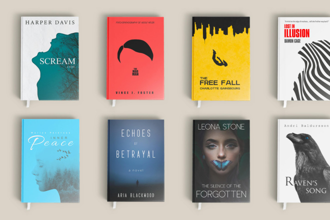
Elements of a Great Book Cover
Creating a successful book cover is a collaborative art. While tastes and trends evolve, the following components are consistently essential:
1. Typography That Tells a Story
The title is often the largest and most visible element. The font choice should align with the book’s genre and tone:
-
A horror novel might use jagged, distressed type.
-
A romance might lean into elegant script fonts.
-
A nonfiction business book may opt for bold, clean, sans-serif fonts to convey authority.
The author’s name and subtitle (if applicable) should also be balanced properly in size and positioning.
2. Striking Imagery or Illustration
Photos, illustrations, or graphic elements can either dominate or subtly support the cover. The key is relevance and impact:
-
A literary novel may use metaphorical imagery.
-
A thriller may feature high-contrast visuals that suggest danger or suspense.
-
A memoir might include a portrait of the author or a symbolic image tied to the narrative.
3. Color Palette with Purpose
Great covers often rely on a limited, cohesive palette to maintain harmony. Consider:
-
Warm palettes for drama or historical fiction.
-
Cool tones for science fiction or self-help.
-
Contrasting colors to create visual tension or highlight key elements.
4. Composition and Balance
A balanced layout guides the eye naturally. Use the rule of thirds, visual hierarchy, and spacing to direct attention. White space can be just as powerful as imagery when used effectively.
5. Genre Appropriateness
One of the most common mistakes in cover design is creating something beautiful that misleads the reader. A light pastel cover may be gorgeous—but not if it’s on a dark psychological thriller. Knowing and honoring genre conventions is crucial.
Common Cover Design Mistakes to Avoid
Even experienced designers sometimes make missteps. Here are a few pitfalls to be aware of:
-
Overcrowding: Too many elements compete for attention.
-
Illegible Typography: Fancy fonts that are hard to read—especially at thumbnail size—hurt discoverability.
-
Poor Image Quality: Pixelated or low-resolution images reflect badly on the entire book.
-
Inconsistency with Genre: Misleading visuals or fonts can alienate the target audience.
-
Ignoring the Back and Spine: In print, these areas are just as important for physical browsing and shelving.
Tips for Working with a Cover Designer
Whether you’re a self-publishing author or working with a publishing house, collaboration is key.
-
Start with a clear brief. Share the book’s genre, target audience, key themes, comparable titles, and your personal vision.
-
Be open to feedback. A good designer understands visual communication and market trends.
-
Review comps (mock-ups) at small and large sizes. What looks good on a full-screen view may lose impact in thumbnail form.
-
Test the cover. Ask potential readers for feedback or conduct A/B tests for digital books.
Many successful authors even test several covers with their audience before launching.
Case Studies: Covers That Got It Right
The Midnight Library by Matt Haig
The cover features a grid of book-shaped windows showing symbolic scenes. It uses navy blue with orange highlights, a clever palette that stands out and aligns with the novel’s contemplative, imaginative tone.
Atomic Habits by James Clear
This bestselling nonfiction book uses minimalist design, a clean serif font, and a white background. It immediately signals clarity, practicality, and professionalism—perfect for the genre.
Circe by Madeline Miller
Gold foil on black, with stylized Greek motifs, makes this cover feel both classic and luxurious. It aligns beautifully with the mythological subject matter and literary style.
The Role of Trends in Cover Design
Book cover design evolves with fashion, technology, and reader expectations. Recent trends include:
-
Minimalism: Less is more, especially in nonfiction.
-
Bold Typography: Large, attention-grabbing titles without images.
-
Retro & Vintage: Nostalgic designs for literary and coming-of-age stories.
-
Hand-drawn Illustrations: Popular in romance, YA, and literary fiction.
-
Abstract Art: Used to convey emotional complexity or avant-garde themes.
While trends can inspire, the best covers also strive for timelessness.
Don’t Forget About Formats
Different formats demand different design considerations:
-
Print Covers require spine and back designs, barcode placement, and bleed settings.
-
Ebook Covers must remain clear at thumbnail size—especially on platforms like Amazon.
-
Audiobook Covers are square, meaning designers must adapt vertical layouts accordingly.
Each format needs optimization without compromising brand identity.
Final Thoughts: Design as a Business Strategy
While we all wish readers would judge a book by its contents, the reality is that design is a business decision. It’s a marketing investment, a branding tool, and a signal to your intended audience. A professional cover can elevate perception, drive sales, and build long-term loyalty.
So whether you’re designing it yourself, hiring a professional, or collaborating with a publisher’s art department, remember this: your cover is not just decoration—it’s a promise to the reader.
Make it a good one.