


In the crowded world of books—whether physical or digital—judging a book by its cover isn’t just common; it’s essential. While authors may labor for months or years on their manuscripts, it’s often the cover design that determines whether readers will ever crack open the first page. That’s not a knock on readers—it’s psychology.
From color theory to visual hierarchy and emotional triggers, cover design is as much science as it is art. In this post, we’ll delve into the psychology behind book cover design and explore why certain covers fly off the shelves while others gather digital dust.
The First Impression: Why Covers Matter
It takes less than a second—literally—for someone to form a first impression of a book based on its cover. According to research from the Missouri University of Science and Technology, people form impressions of visual stimuli in just 0.2 seconds. That’s all the time you get to captivate, intrigue, or emotionally hook a potential reader.
A cover acts like a book’s marketing billboard. It communicates genre, tone, professionalism, and even perceived value in an instant. In fact, self-published authors who invest in professionally designed covers often report a 200%+ increase in sales after a redesign.
So what makes a book cover sell? Let’s explore.
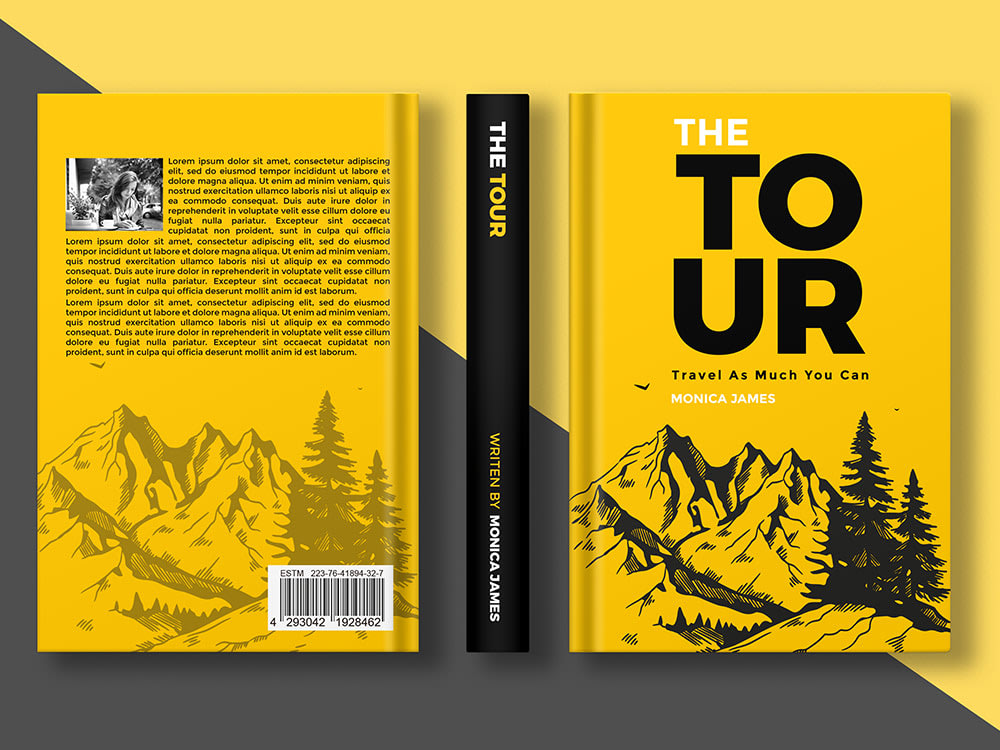
1. Color Psychology: More Than Meets the Eye
Color is one of the first things the brain registers. Each hue triggers specific emotional and psychological responses:
-
Red conveys urgency, passion, and intensity. It’s great for thrillers or romance novels.
-
Blue suggests trust, calm, and intellect—ideal for business or self-help books.
-
Yellow exudes optimism and energy, often used in upbeat memoirs or young adult fiction.
-
Black implies mystery, sophistication, or elegance—frequently seen in crime or literary fiction.
Genres tend to adopt specific palettes because readers subconsciously associate colors with the type of story they expect. Deviating too far from genre norms can cause confusion and missed opportunities, but smart subversion can also create curiosity if done intentionally.
2. Typography: What Fonts Say Without Words
Fonts do more than convey a title—they communicate tone. Typography can suggest whether a book is serious or playful, historical or modern.
-
Serif fonts (like Garamond or Baskerville) are traditional and trustworthy, often used for historical fiction or literary works.
-
Sans-serif fonts (like Helvetica or Futura) feel clean and modern, great for nonfiction, especially in business or technology.
-
Script fonts can feel romantic or whimsical but should be used sparingly for legibility.
-
Distressed or grunge fonts can add edge or darkness, common in horror or dystopian genres.
Font weight, spacing, and hierarchy also play psychological roles. A bold, centered title commands attention and signals confidence. A subtler title placed lower on the page may suggest intrigue or suspense.
Pro tip: Never use more than two or three fonts on a cover. Visual cohesion keeps the design professional and psychologically harmonious.
3. Imagery and Symbolism: Speaking to the Subconscious
The brain loves symbols. A well-placed image or metaphorical object can speak volumes. For example:
-
A lone figure on a cliff instantly conveys isolation, adventure, or introspection.
-
A broken watch can symbolize lost time, missed opportunities, or a mysterious timeline.
-
Hands reaching might signal connection, struggle, or longing.
Imagery works on both conscious and subconscious levels. When readers see symbols they associate with particular themes, they mentally “tag” the book as a potential match for their interests.
Psychological insight: The human brain processes images 60,000 times faster than text. A powerful visual can tell an entire story before a single word is read.
4. Genre Expectations: Fit In to Stand Out
Each book genre has unwritten visual rules that help readers identify what they’re looking for. Breaking those rules too drastically can alienate potential buyers. For instance:
-
Romance covers often feature warm colors, attractive protagonists, and emotional expressions.
-
Fantasy novels lean toward elaborate typography, mythical creatures, and ethereal landscapes.
-
Thrillers frequently use dark colors, stark contrasts, and suggestive imagery like blood, shadows, or urban decay.
To design a cover that sells, it’s important to understand genre conventions—and then either align with them or subvert them intentionally with a clear purpose.
Case Study: When The Hunger Games debuted, its minimalist black cover with a single mockingjay symbol defied typical young adult trends. But because it still conveyed intrigue and rebellion, it intrigued readers rather than confusing them.
5. Hierarchy and Composition: Guiding the Eye
Effective book covers guide the viewer’s eye in a deliberate way. This is achieved through visual hierarchy—organizing elements so the most important information is seen first.
Elements to consider:
-
Title placement: Should be bold and central (unless the author is famous).
-
Author name: Secondary to the title unless the writer has strong brand recognition.
-
Taglines or subtitles: Help contextualize the book quickly, especially for nonfiction.
Design techniques like the Rule of Thirds, leading lines, and negative space can all be used to direct attention and make the cover visually pleasing.
Psychology tip: Readers often scan in a “Z” pattern (top left to bottom right), so positioning elements along that path increases engagement.
6. Emotional Triggers: Create Connection
Humans are emotional decision-makers. The most successful covers are the ones that evoke feeling—curiosity, tension, nostalgia, hope, fear, or excitement.
To trigger emotion:
-
Use evocative imagery that hints at the story’s central conflict or character journey.
-
Choose colors that align with the emotional tone.
-
Avoid clutter. A simple, striking design can evoke stronger feelings than a busy one.
Example: The Fault in Our Stars by John Green uses simple colors and clouds, but the cover’s handwritten font and unusual color pairing evoke teenage vulnerability and whimsy—perfectly aligning with the story.
7. Cultural Sensitivity and Trends
Today’s readers are highly attuned to representation, cultural cues, and social trends. A cover that appears tone-deaf or outdated can cost you readers. Designers must be culturally aware and inclusive, especially when depicting characters or symbols.
Staying on top of design trends is also vital. What sold in 2010 may not work now. Flat design, bold minimalism, and textured realism are just a few trends cycling through the publishing world.
Final Thoughts: Invest in Your Cover—It Pays Off
Design is not decoration—it’s communication. A great cover acts as a bridge between your story and your audience. It doesn’t just look good; it feels right. It tells readers, “This is the book you’ve been searching for.”
Whether you’re self-publishing or traditionally publishing, don’t underestimate the power of a well-crafted cover. Hire a professional designer, study your genre’s top-selling books, and most importantly—understand your audience’s psychology.
Remember, readers may not judge a book by its words at first—but they absolutely judge it by its cover.
What do you think?
Have you ever bought a book just because the cover spoke to you? Or redesigned your book and seen better results? Share your experiences in the comments below!