


Color printing is something most people encounter every day without ever thinking about how it actually works. From magazines and brochures to packaging, posters, business cards, and books, printed materials surround us constantly. Yet many people assume printers simply “mix colors” the same way a computer screen displays them. In reality, printing uses a completely different system — one based on ink, light absorption, and tiny dots layered with incredible precision.
If you have ever wondered why digital colors sometimes look different when printed, or why designers constantly talk about “CMYK,” this guide will explain everything in simple terms. Understanding the basics of color printing can help businesses, designers, marketers, and even casual customers make better decisions when preparing materials for print.
The Difference Between Screen Color and Print Color
Before understanding CMYK, it is important to understand one key concept: screens and printers create color in completely different ways.
Computer monitors, phones, and TVs use light to display color. Printing uses ink on paper.
This difference changes everything.
Screens Use RGB
Digital screens use the RGB color model:
- Red
- Green
- Blue
These colors are made of light. When combined at full intensity, they create white light. This system is called additive color mixing because colors are added together to create brightness.
For example:
- Red + Green = Yellow
- Red + Blue = Magenta
- Green + Blue = Cyan
- Red + Green + Blue = White
Because screens emit light, colors often appear extremely bright, vibrant, and glowing.
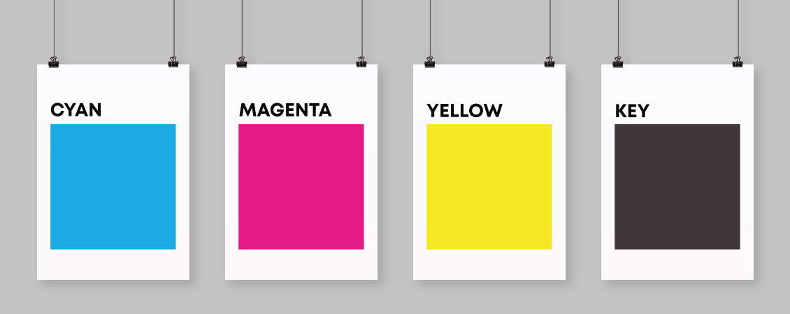
Printing Uses CMYK
Printers work differently. Instead of emitting light, they place colored inks onto paper that reflects light back to your eyes.
The CMYK system stands for:
- Cyan
- Magenta
- Yellow
- Key (Black)
This system is called subtractive color mixing because inks subtract or absorb portions of light.
When white light hits printed paper:
- Cyan absorbs red light
- Magenta absorbs green light
- Yellow absorbs blue light
The remaining reflected light is what you see as color.
Why CMYK Uses Cyan, Magenta, and Yellow
Many people ask why printers do not simply use red, blue, and yellow.
The answer lies in color accuracy.
Cyan, magenta, and yellow are more effective for reproducing a wider range of colors in print. These inks allow printers to create thousands of shades through layering and dot patterns.
For example:
- Cyan + Yellow = Green
- Magenta + Yellow = Red
- Cyan + Magenta = Blue
- Cyan + Magenta + Yellow = Dark brown or muddy black
This brings us to another important question.
Why Is There a Separate Black Ink?
If cyan, magenta, and yellow can create dark colors, why add black?
Technically, combining all three inks can create something close to black. However, in practice, it usually produces a muddy dark brown instead of a rich, clean black.
Using a dedicated black ink offers several advantages:
1. Better Text Quality
Black ink creates sharper and cleaner text, especially for small fonts.
2. Improved Contrast
Images gain stronger shadows and deeper tones.
3. Reduced Ink Usage
Using black ink is more economical than layering large amounts of cyan, magenta, and yellow.
4. Faster Drying
Too much combined ink can saturate paper and slow drying times.
The “K” in CMYK stands for “Key,” referring to the key printing plate traditionally used for detail and contrast.
How Printers Actually Create Images
One of the most fascinating aspects of printing is that printers usually do not blend wet inks together the way paint mixes on a palette.
Instead, printers use extremely tiny dots.
This process is called halftoning.
The Magic of Tiny Dots
If you look closely at a printed magazine image with a magnifying glass, you will see tiny cyan, magenta, yellow, and black dots arranged in patterns.
Your eyes blend these dots together from a normal viewing distance, creating the illusion of smooth color gradients.
For example:
- More yellow dots create warmer tones
- More cyan dots create cooler tones
- Different dot sizes create lighter or darker shades
Modern printers place these dots with incredible precision, often at resolutions of 300 DPI (dots per inch) or much higher.
Understanding Color Separation
When preparing a design for professional printing, the artwork is separated into four layers:
- Cyan layer
- Magenta layer
- Yellow layer
- Black layer
Each layer tells the printer exactly where to place that specific ink.
During printing, the paper passes through multiple printing units, each applying one color at a time. When perfectly aligned, the combined layers form the final full-color image.
This process is especially common in offset printing, which is widely used for:
- Books
- Newspapers
- Packaging
- Catalogs
- Magazines
- Marketing materials
Why Printed Colors Sometimes Look Different
One of the most common frustrations in design and printing is color inconsistency between screen and print.
A bright neon blue on a monitor may appear duller on paper. Vibrant greens may shift slightly. Deep glowing reds may lose intensity.
There are several reasons for this.
1. Screens Emit Light
Digital colors naturally appear brighter because they glow.
2. CMYK Has a Smaller Color Range
Some RGB colors simply cannot be reproduced accurately with ink.
This is called the color gamut limitation.
3. Paper Type Affects Color
Glossy paper reflects light differently than matte or textured paper.
4. Printer Calibration Matters
Professional printers carefully calibrate machines to maintain consistency.
5. Lighting Conditions Change Perception
Printed colors may look different under daylight, office lighting, or warm indoor bulbs.
The Role of Paper in Color Printing
Paper plays a much larger role in color appearance than many people realize.
Glossy Paper
- Produces vibrant colors
- Enhances contrast
- Reflects more light
- Common for magazines and photo printing
Matte Paper
- Creates softer, more elegant tones
- Reduces glare
- Preferred for luxury branding and art books
Uncoated Paper
- Absorbs more ink
- Produces more natural, muted colors
- Common for books and stationery
Even the brightness and texture of paper can significantly affect final results.
What Is Rich Black?
Designers often use two types of black in printing.
Standard Black
Usually 100% black ink only.
Best for:
- Small text
- Thin lines
- Precise typography
Rich Black
A mixture of black plus small amounts of cyan, magenta, and yellow.
Example:
- C: 60
- M: 40
- Y: 40
- K: 100
Rich black creates deeper, more luxurious dark areas in large printed elements such as:
- Backgrounds
- Posters
- Packaging
- Premium branding
What Happens During Professional Printing
Professional offset printing is an impressive mechanical process.
Here is a simplified overview:
Step 1: File Preparation
Design files are converted into CMYK format.
Step 2: Color Separation
The artwork is divided into four printing plates.
Step 3: Plate Creation
Each plate corresponds to one ink color.
Step 4: Ink Application
Paper passes through printing units applying cyan, magenta, yellow, and black inks sequentially.
Step 5: Drying and Finishing
The printed sheets dry before cutting, folding, binding, or coating.
Modern industrial presses can print thousands of sheets per hour with remarkable accuracy.
Digital Printing vs Offset Printing
Both digital and offset printing use CMYK principles, but the technology differs.
Digital Printing
- Faster for small quantities
- No printing plates required
- Good for short runs and personalized materials
- Common in office and on-demand printing
Offset Printing
- Higher quality for large runs
- Better color consistency
- More economical at high volumes
- Preferred for commercial publishing
Offset printing remains the gold standard for large-scale professional production.
Spot Colors and Pantone
Sometimes CMYK is not enough.
Brands often require extremely precise colors that must remain identical across all materials.
This is where spot colors and the Pantone Matching System come in.
Instead of mixing CMYK inks, printers use pre-mixed specialty inks for exact color reproduction.
This is especially important for:
- Corporate logos
- Luxury packaging
- Brand identity systems
- Metallic and fluorescent colors
For example, a company’s signature blue may use a dedicated Pantone ink to ensure consistency worldwide.
Common Mistakes When Preparing Files for Print
Many printing issues happen before the printer even starts working.
Using RGB Instead of CMYK
Files created only for screens may produce unexpected printed colors.
Low Image Resolution
Images intended for print should typically be at least 300 DPI.
Ignoring Bleed Areas
Designs extending to the edge of the page need extra margin space called bleed.
Overusing Rich Black
Rich black should not be used for small text because slight misalignment can blur letters.
Not Requesting Proofs
Professional print proofs help identify problems before mass production.
Why Understanding CMYK Matters
Even basic knowledge of CMYK can improve communication with printers and designers.
It helps businesses:
- Achieve better brand consistency
- Avoid expensive printing mistakes
- Prepare files correctly
- Understand color limitations realistically
- Choose appropriate materials
For designers, understanding print production is essential because great digital designs do not always translate perfectly onto paper.
The Science Behind Everyday Printing
Color printing combines physics, chemistry, engineering, and visual perception in surprisingly sophisticated ways. What appears to be a simple printed image is actually the result of carefully layered microscopic dots, precise ink control, calibrated machinery, and material science.
The next time you hold a beautifully printed magazine, packaging design, or brochure, take a closer look. Behind every smooth gradient and vivid image is a highly refined system built around four simple inks: cyan, magenta, yellow, and black.
CMYK may seem technical at first, but its core idea is remarkably simple: by carefully controlling how ink absorbs and reflects light, printers can recreate an extraordinary world of color on paper.