


In a world dominated by digital communication, printed catalogues continue to hold a unique and powerful position. A well-designed catalogue is more than a collection of pages presenting products, services, or ideas — it is a carefully crafted experience that communicates a brand’s identity, values, and attention to detail. Unlike a digital advertisement that can disappear with a simple scroll, a printed catalogue creates a physical connection with the reader. It invites people to touch, explore, and spend time with the content.
Designing a perfect printed catalogue is both a creative and strategic process. It requires understanding the audience, choosing the right structure, balancing visual and textual elements, selecting appropriate materials, and ensuring that every detail — from typography to paper quality — contributes to the overall message. A successful catalogue does not simply display information; it tells a story.
Understanding the Purpose: A Catalogue Is More Than a List
The first step in creating an effective catalogue is defining its purpose. Every catalogue has a specific goal. It may introduce a new collection, showcase a company’s achievements, present products to potential customers, support sales activities, or serve as a long-lasting brand presentation.
A common mistake is to treat a catalogue as a simple product database. While information is essential, the best catalogues go beyond descriptions and prices. They create context. They explain why a product matters, how it fits into the customer’s lifestyle, and what makes it different from alternatives.
A furniture catalogue, for example, should not only show chairs and tables. It should communicate comfort, design philosophy, craftsmanship, and the atmosphere a customer can create in their home. A fashion catalogue should not only display clothing pieces but also express a mood, a season, and a brand identity.
The perfect catalogue begins with a clear understanding of the story it wants to tell.
Knowing the Audience: Designing for the Reader
Great design always starts with the audience. A catalogue created for luxury products will have a different visual language from one designed for educational materials, industrial equipment, or handmade products.
Understanding the target audience helps determine:
- the tone of communication;
- the style of photography;
- the amount of information provided;
- the choice of colors and typography;
- the overall feeling of the catalogue.
A catalogue for a high-end brand may use minimal layouts, premium paper, and elegant typography to create a sense of exclusivity. A catalogue for a family-oriented business may focus on warmth, accessibility, and clear navigation.
The reader should feel that the catalogue was created specifically for them. Every design decision should answer one important question: “Does this help the audience understand, trust, and connect with the brand?”
The Importance of Structure and Organization
A beautiful catalogue can still fail if it is difficult to navigate. Structure is one of the most important elements of catalogue design.
A professional catalogue usually follows a logical flow:
- introduction and brand story;
- main product or service categories;
- detailed presentations;
- supporting information;
- contact details and final message.
The organization should guide the reader naturally through the pages. Sections, headings, indexes, and visual separators help create a comfortable reading experience.
Consistency is also essential. Similar products should be presented in a similar format, making it easier for readers to compare options. If every page looks completely different, the catalogue may feel chaotic and reduce trust.
Good design creates order without making the experience feel rigid.
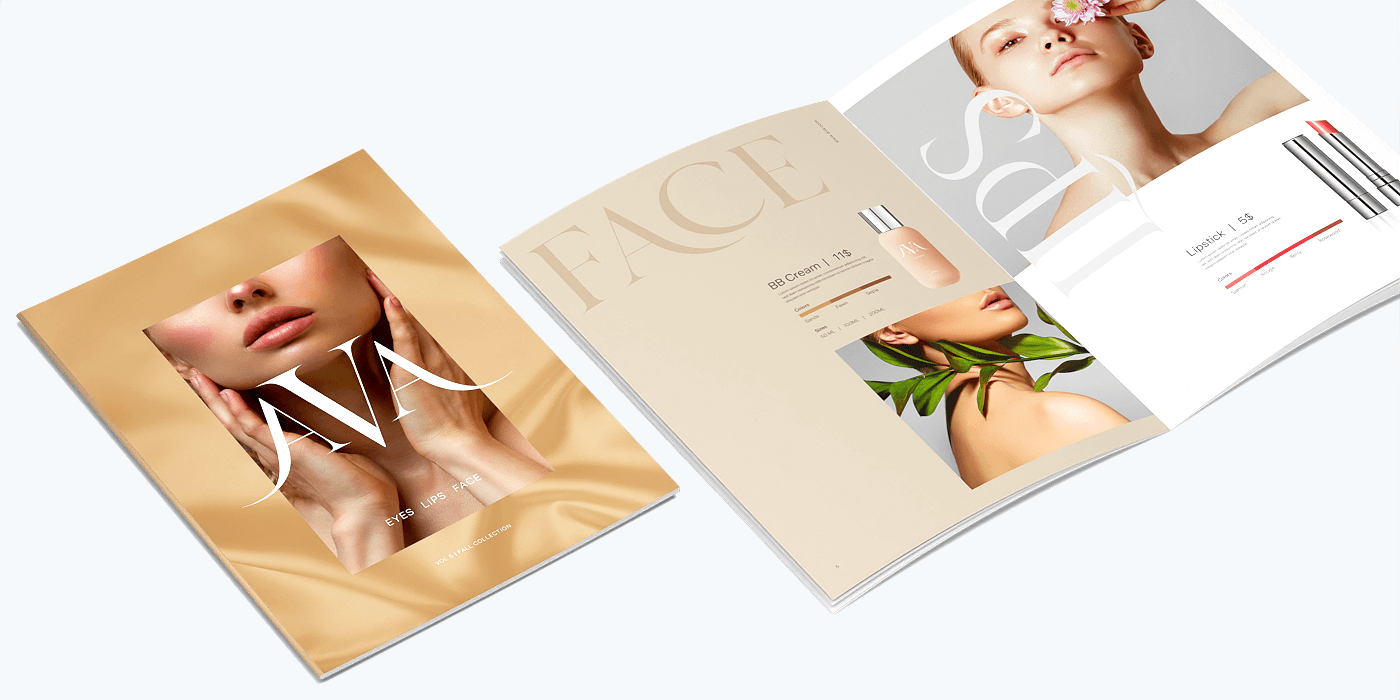
Visual Storytelling: The Power of Images
Photography is one of the most important elements of a printed catalogue. In many cases, images communicate faster than words. A high-quality photograph can create emotions, highlight details, and influence purchasing decisions.
Professional catalogue photography should focus not only on showing the product but also on presenting its character. Lighting, composition, background, and styling all contribute to the perception of quality.
For example, a handmade ceramic product photographed on a plain background communicates functionality, while the same product photographed in a carefully designed interior communicates lifestyle and emotion.
The relationship between images and text is also crucial. Images should not simply fill empty spaces; they should work together with the written content to create a complete message.
Typography: Creating a Visual Voice
Typography plays a major role in shaping the personality of a catalogue. Fonts influence how readers perceive a brand. Elegant serif fonts may communicate tradition and sophistication, while modern sans-serif fonts can create a feeling of innovation and simplicity.
A successful catalogue usually combines different text elements:
- strong headlines that attract attention;
- readable body text;
- highlighted information for important details;
- captions that support images.
However, using too many fonts can create confusion. Professional catalogue design focuses on harmony and readability.
Typography is not only about choosing beautiful letters; it is about creating a comfortable reading experience.
Colors and Brand Identity
Color selection is another key element of catalogue design. Colors create emotional responses and strengthen brand recognition.
A catalogue should reflect the brand’s existing visual identity while using colors strategically. Bright colors may create energy and creativity, while neutral tones may communicate elegance and professionalism.
The challenge is finding balance. Too many colors can distract from the content, while a lack of color variation can make the catalogue feel uninspired.
A carefully designed color palette helps create a unified experience from the first page to the last.
Paper Selection: The Physical Experience Matters
One of the unique advantages of printed catalogues is the physical experience they provide. Paper quality can completely change how a catalogue is perceived.
The choice of paper depends on the purpose and character of the publication:
- thick, textured paper can create a premium feeling;
- glossy paper can enhance photography;
- matte paper can create a sophisticated and modern appearance;
- recycled paper can communicate environmental responsibility.
The cover is especially important because it creates the first impression. A strong cover design encourages people to open the catalogue and explore further.
Printing techniques such as embossing, special finishes, or unique binding methods can add additional value and make the catalogue memorable.
The Role of Professional Printing
Even the best design can lose its impact without high-quality printing. Colors, images, and materials must be carefully managed to ensure the final result matches the original concept.
Professional printing requires attention to:
- color accuracy;
- image resolution;
- paper compatibility;
- binding quality;
- finishing details.
A catalogue represents the brand, so every physical element communicates something. Poor printing quality can negatively affect the perception of the entire company or product.
Balancing Creativity and Functionality
The perfect catalogue is a balance between artistic expression and practical usability.
Creativity makes a catalogue memorable. Functionality makes it effective.
A catalogue should inspire the reader while also helping them find the information they need. Designers must avoid excessive decoration that distracts from the main purpose.
The strongest catalogues feel effortless. The reader does not notice every design decision individually — instead, they experience a smooth and engaging journey.
Sustainability and the Future of Printed Catalogues
Modern catalogue design increasingly considers environmental responsibility. Many brands are choosing sustainable materials, eco-friendly printing methods, and thoughtful production processes.
Sustainability does not mean compromising quality. Today, environmentally conscious printing solutions can create beautiful and premium publications while reducing environmental impact.
A catalogue can become not only a marketing tool but also a reflection of a company’s values.
Final Thoughts: Creating a Catalogue That Leaves an Impression
A perfect printed catalogue is created through the combination of strategy, creativity, and craftsmanship. It requires much more than arranging images and text on pages. It requires understanding people, building a visual story, choosing the right materials, and paying attention to every detail.
A successful catalogue invites the reader into the world of a brand. It transforms information into an experience and products into stories.
In an age where so much communication happens digitally, a thoughtfully designed printed catalogue remains a powerful reminder of the value of physical connection. The texture of the paper, the quality of the images, and the harmony of the design all work together to create something memorable — something that readers can hold, explore, and remember.