
­

About antares2015

This author has not yet filled in any details.
So far antares2015 has created 1491 blog entries.
15 09, 2026
  • FA_DOCUMENT_PRINTING

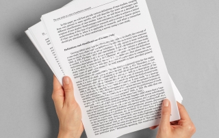
Why People Treat Printed Documents More Seriously

We live in a world where most information appears on screens. Contracts are signed digitally, reports are shared through cloud platforms, invitations arrive by email, and important announcements can be distributed to thousands of people with a single click. Yet despite the convenience of digital communication, something interesting happens when information is printed on paper: […]

14 09, 2026
  • Block-Printing

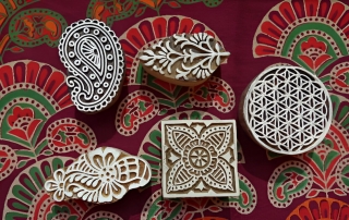
Can Printing Have a Signature Style?

When we think about style in publishing, we usually think about the designer. We notice a distinctive typeface, an unusual composition, a particular color palette, or a recognizable approach to photography and illustration. But what if the printing house itself can have a style?

At first, this may sound strange. After all, a printing house receives […]

11 09, 2026
  • beau

The Most Beautiful Printing Mistakes in History

Misprints, unexpected colors, registration errors and accidental design discoveries

Printing is usually associated with precision. A page passes through presses, plates, rollers, inks and cutting machines, all carefully calibrated to reproduce an image or text as faithfully as possible. The goal seems simple: make every copy look exactly like the original.

But the history of printing tells […]

10 09, 2026
  • Heading

Why Some Colors Are Impossible to Reproduce Exactly

You choose a color on your screen. You adjust it until it looks perfect. You send the file to the printer — and when the printed piece arrives, something feels wrong.

The blue is slightly duller. The red looks darker. The green has lost its brightness. Perhaps the color that looked almost fluorescent on your monitor […]

9 09, 2026
  • ddd

What Happens When a Designer’s Screen Meets a Printing Press?

A designer can spend hours choosing the perfect color, adjusting a line by a fraction of a millimeter, comparing typefaces, and staring at a screen until every detail feels exactly right.

Then the file goes to print.

And suddenly, things change.

The blue that looked rich and luminous on the monitor appears darker on paper. The subtle gray […]

8 09, 2026
  • black

The Art of Making Black: Why “Black” Isn’t Just Black

Black seems like the simplest color in the world.

It is the color designers use when they want something to feel elegant, serious, minimal, dramatic, or timeless. It appears in almost every visual identity, from luxury packaging to newspapers, books, posters, business cards, and fashion catalogues.

On a screen, black appears to be straightforward: choose black, and […]

7 09, 2026
  • white

Why White Isn’t Always White in Printing

White seems like the simplest colour in the world.

On a computer screen, you open a blank document and see white. In a design program, the background is white. You send the file to a printer, expecting that same clean, neutral white to appear on paper.

And then something looks… different.

The background might seem slightly yellow, grey, […]

4 09, 2026
  • small

The 1-Millimeter Problem: How Tiny Production Decisions Change the Final Result

In design, one millimeter sounds insignificant.

It is smaller than a fingernail. You probably would not notice it on a ruler. On a computer screen, a one-millimeter difference can feel almost meaningless.

But in print, one millimeter can be the difference between something looking perfectly balanced and something feeling strangely wrong.

A margin can become too narrow. A […]

3 09, 2026
  • 2-Spectrum-Catalogue

Why Some Printed Objects Look Expensive — Even When They Aren’t

Why does one business card feel like it belongs to an international luxury brand, while another — printed on almost the same budget — looks ordinary? Why can a simple invitation feel exclusive, while a much more expensive brochure somehow looks cheap?

The answer is not always the price of the paper, the number of colors […]

2 09, 2026
  • Graphic-Design-Course-Banner-1920x960-1

The Things Designers Notice That Everyone Else Ignores

A perfectly aligned line of text. The exact shade of black used for a headline. A paper stock that feels slightly warmer than expected. The tiny difference between two colors that were supposed to be identical.

Most people never notice these things.

Designers do.

For designers, the world of printed materials is full of details that exist almost […]