


You enter a museum, collect a ticket, glance at a map, and follow an arrow towards the first gallery. Inside, a few sentences on the wall introduce the exhibition. A small label tells you when a painting was made. Later, you buy a postcard of the work you liked most.
You probably remember the painting. You may never think about the ticket, arrow, label, or postcard.
Yet each belongs to the printed world surrounding the collection. Some pieces explain what you see; others help you move, participate, or remember. They rarely compete for attention, but a museum visit would feel very different without them.
The exhibition begins before the first object
Before you reach a display case, printed material has already helped set your expectations.
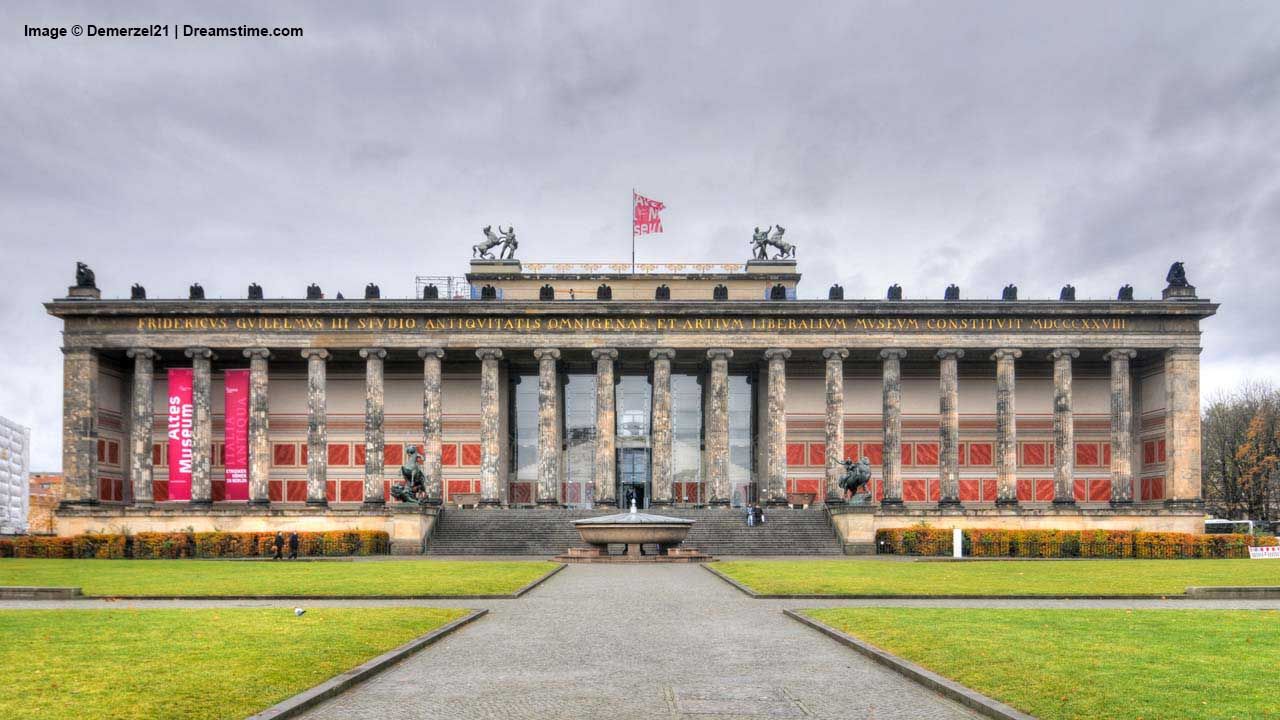
A banner outside announces the exhibition. A poster near the entrance gives you a title, an image, and a date. Their scale, colours, and typography suggest something about the experience ahead: perhaps an intimate photography show, perhaps a lively exhibition for families.
These are invitations, but they also create recognition. The same image might appear on a brochure, a ticket, and a catalogue cover. By the time you enter the gallery, it already feels familiar.
We tend to treat this visual consistency as part of the museum itself. Someone, however, had to translate a design into physical materials that would work on different surfaces and at different sizes.
The small label doing a large job
An object label may be the least glamorous printed item in the room. It can also change your understanding in seconds.
A ceramic bowl becomes more interesting when you learn where it was made and how it was used. A portrait takes on another meaning when its date places it during a war. A material you assumed was stone turns out to be painted wood.
Even a short label requires choices. Which information comes first? How large should the lettering be? Can visitors read it without leaning towards the object? Is the contrast strong enough in the gallery lighting?
When those decisions work, you barely notice the label as a designed object. You simply read it and look again.
The wall that becomes a page
The introductory text at the entrance to an exhibition is often printed on a panel or applied as vinyl lettering. Further inside, quotations, timelines, and section titles turn walls into reading surfaces.
Unlike a book, a gallery cannot assume that everyone starts at the beginning. Visitors wander, skip rooms, return to favourite objects, and read selectively. Printed interpretation has to accommodate that movement.
A heading offers a quick foothold. A paragraph supplies context. A timeline helps connect objects separated by centuries.
Large graphics also influence the room’s atmosphere. An enlarged photograph can establish a setting, while a printed map makes distant places easier to imagine. Sometimes the background you remember was a carefully produced print.
All the arrows you forget
Wayfinding is easiest to appreciate when it fails.
You notice a missing arrow when you cannot find the next room. You notice an unclear floor plan when you have walked upstairs searching for an exhibition located downstairs.
Successful signs attract much less attention. They guide you towards galleries, lifts, toilets, exits, and places to rest, often through printed panels, stickers, or portable maps.
Their job sounds straightforward until you consider the building. A visitor might approach from several directions, speak another language, or need a step-free route.
A good printed map makes that complexity manageable. It gives you enough confidence to explore instead of repeatedly asking where to go.
The paper that lets you join in
In a family gallery, print often moves from the wall into someone’s hands.
A child receives a sheet asking them to find an animal in a painting. Another draws a missing detail or follows a trail through the rooms. A teacher uses a worksheet to start a conversation.
These modest materials can turn looking into an activity. A question on paper gives visitors something specific to notice, without requiring a screen or an elaborate installation.
Physical design matters here too. There must be room to write, instructions must be clear, and the paper needs to survive being carried around.
The best activity sheet feels simple because its makers have thought carefully about how someone will actually use it.
The printed image beside the original
Museums also print things that help explain objects they cannot display fully.
A manuscript may be open at one page, with reproductions showing other sections nearby. An enlarged image can reveal a detail too small to see through glass. A photograph may show an archaeological object at the place where it was discovered.
These prints provide access to information beyond the original’s visible surface.
They also require clear identification. Visitors should understand whether they are looking at an original, a facsimile, or an explanatory reproduction. That distinction helps preserve trust while allowing the exhibition to show more than the physical object alone can reveal.
The ordinary details around the edges
Some printed materials sit almost entirely outside the story of the exhibition.
A cloakroom ticket connects you to your coat. A sticker identifies a school group. A notice explains photography rules. A folded programme tells you when a gallery talk begins.
You may encounter a printed menu in the café, a feedback card near the exit, or a membership leaflet at reception.
None is likely to become the highlight of your visit. Together, though, they handle practical questions that would otherwise interrupt it. They are part of the everyday work of welcoming people into a building and helping them feel comfortable there.
What leaves the museum with you
At the shop, print becomes something you choose to keep.
A postcard offers an affordable reminder. A catalogue allows you to revisit the exhibition slowly, with essays and images you had little time to study in the galleries. A child’s completed activity sheet records a more personal experience.
Back home, these objects take on new roles. The postcard goes above a desk. The ticket stays inside a book. The catalogue becomes a reference.
Next time you visit a museum, look briefly at what surrounds the exhibits. Notice the map in your hand, the lettering on the wall, and the label that makes you pause. Much of what helps you see the collection has been printed.