


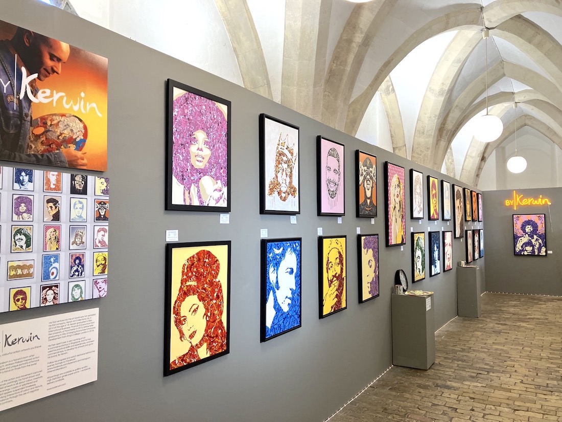
A visitor pauses in front of a painting, reads the small label beside it, and moves on. Later, they unfold a museum map, pick up a children’s activity sheet, and browse a catalogue in the shop. None of these actions seems remarkable. Yet each depends on something rarely acknowledged when an exhibition opens: the work of turning curatorial ideas into printed objects.
We remember exhibitions through their artworks, installations, and stories. But much of what helps us navigate and understand them comes from print. Labels, wall graphics, tickets, maps, catalogues, and educational materials give an exhibition a readable form. Behind these seemingly modest objects lies a network of designers, editors, translators, printers, and production specialists whose work becomes part of the visit.
The small label with a large responsibility
A museum label has very little space in which to do an important job. It must identify an object and, sometimes, explain why we should spend another minute looking at it.
A title, date, artist’s name, material, and collection credit might appear straightforward. Together, however, they require decisions about wording, order, typography, and spacing. Add a second language, and the available space becomes tighter. Add an interpretive paragraph, and the label must balance information with the visitor’s patience.
Printing brings those decisions into the room. Text that looks comfortable on a designer’s screen may feel too small beside a large painting. A reflective surface can make reading difficult under gallery lights. A subtle colour combination may be elegant but lack enough contrast.
The label’s success is measured in an ordinary moment: someone can read it comfortably, understand it, and return their attention to the object.
When walls become pages
An exhibition’s introductory text often provides the first substantial encounter with its argument. Before visitors examine individual works, a wall tells them where they are, what period they are entering, or which question connects the objects.
Here, printing operates at an architectural scale. Text, photographs, timelines, and graphic elements must work across a surface much larger than a book page. Their relationship to doors, corners, display cases, and walking routes matters.
There is also a difference between seeing a wall from the entrance and reading it at close range. A heading needs to attract attention from a distance; the paragraphs beneath it need to reward someone who approaches.
Printed wall graphics can establish rhythm throughout an exhibition. A change of colour may announce a new section. A timeline may connect rooms that otherwise feel separate. The design helps visitors recognise the structure of the exhibition before they have read every word.
Tickets and maps: the practical beginning
The exhibition experience can begin with a printed ticket, an invitation, or a folded guide handed over at reception.
These objects carry practical information, but they also establish expectations. Their visual language introduces the exhibition’s identity through type, colour, and imagery. A small ticket can feel like the first piece of a larger, coherent experience.
Maps have a more demanding task. They translate a building into something a visitor can understand quickly. Entrances, stairs, lifts, facilities, and gallery numbers must remain legible within a limited area.
A useful map anticipates moments of uncertainty. It helps someone find the next room, locate an accessible route, or return to an object they want to see again. Its value becomes clear when a visitor can stop worrying about directions and concentrate on the exhibition.
The catalogue that outlives the rooms
An exhibition is temporary. Its catalogue can remain on a bookshelf for decades.
This gives the printed publication a different responsibility from the gallery label. It can accommodate longer arguments, detailed captions, essays, and images that invite repeated examination. It also allows the exhibition to reach readers who never entered the museum.
Producing a catalogue requires its own set of judgments. How large should reproductions be? Which details deserve a full page? Will captions be easy to find? Can the book open comfortably enough for readers to study an image near the binding?
Paper, printing, and binding influence these encounters. A catalogue is both a record of an exhibition and a physical object with its own pace. Visitors move through rooms; readers move through pages. The two experiences need to be related without being identical.
Educational materials invite participation
Some of the most useful exhibition print is designed to be handled, marked, folded, or taken home.
A children’s worksheet might ask visitors to find a recurring shape. A teacher’s guide might connect objects to classroom discussion. A family booklet might offer questions that adults and children can explore together.
Good educational materials make room for a response. They give visitors something to notice, compare, draw, or debate, rather than simply repeating the wall text in smaller form.
Their physical design matters as much as their wording. There must be enough space to write. Instructions need to be easy to follow. A sheet intended for use while walking should be manageable without a desk. These are modest considerations, but they determine whether the material becomes part of the visit or remains untouched.
The work before opening night
For the production team, an exhibition’s printed elements form an interconnected set. A revised title may need updating on a wall, in a leaflet, and inside a catalogue. A corrected date might affect several labels. Different languages must remain consistent across formats.
Proofreading therefore involves more than checking spelling. It includes checking names, credits, image placement, dimensions, and the relationship between the printed piece and its intended location.
The work is easiest to overlook when it is done well. Visitors encounter clear information and a coherent visual environment. They rarely see the rounds of corrections, sample prints, material choices, or installation adjustments that made this possible.
Printing deserves a place in how we discuss exhibitions because it shapes access to them. It helps people find their way, understand what they are seeing, and continue thinking after they leave. A label can open a conversation with an object. A map can give someone confidence to explore. A catalogue can keep an exhibition alive long after its walls have been cleared.