


Luxury is often described in terms of rarity, exclusivity and price. We associate it with prestigious names, limited editions, beautiful spaces and objects that signal status. But before we know what something costs, before we recognize a brand name and before we understand its story, we often experience it through something much simpler: touch.
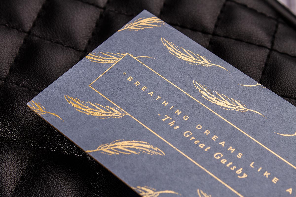
We pick up a box. We run our fingers across a textured cover. We notice the resistance of thick paper. We feel an embossed letter beneath our fingertips or catch the slight shine of metallic foil under the light. These details may seem small, but together they can transform an ordinary printed object into something that feels valuable.
This is one of the great paradoxes of modern luxury: in an increasingly digital world, some of the strongest signals of quality remain physical.
The Luxury of Slowing Down
Digital experiences are designed to be fast. We scroll, swipe, click and move from one piece of content to another almost automatically. A screen gives us information immediately, but it rarely asks us to physically engage with the object itself.
Printed materials work differently.
A beautifully produced book, invitation, catalogue or package requires us to interact with it. We hold it. Open it. Turn its pages. Notice its weight. The experience unfolds through a series of physical sensations.
That slowness can itself become a form of luxury.
Luxury is not necessarily about having more. It can be about having an experience that feels more considered. When a physical object has been carefully designed, the user senses that someone has paid attention to details that might otherwise have been ignored.
The thickness of a business card, the softness of a paper stock or the sound a rigid box makes when it opens can communicate quality before a single word is read.
Paper Is More Than a Surface
Paper is one of the most underestimated elements in communication.
Two publications can contain exactly the same text and images, yet feel completely different because of the paper on which they are printed.
A lightweight, smooth paper can suggest practicality and efficiency. A heavy uncoated stock may feel natural, sophisticated and editorial. Cotton papers can create a sense of softness and permanence, while textured stocks can make a printed piece feel almost handmade.
Paper has weight, temperature, grain and resistance. It can absorb ink or allow it to sit sharply on the surface. It can be smooth or rough, soft or rigid, matte or glossy.
These characteristics create an experience that cannot be fully reproduced on a screen.
This is particularly important for luxury publishing, fashion, hospitality, cosmetics, architecture and art. In these industries, the physical object is not simply a container for information. It is part of the brand experience.
A luxury catalogue is not only selling products. Its paper, binding, photography and typography are communicating what the brand believes quality should feel like.
Texture Creates Memory
Touch has an unusual relationship with memory.
We may forget the exact wording of an advertisement, but remember the feeling of opening an impressive package. We may not remember every image in a catalogue, but remember the roughness of its cover or the weight of the book in our hands.
Texture creates physical associations.
A soft-touch coating can make packaging feel smooth and almost velvety. Linen textures can evoke craftsmanship. Embossed patterns can make a surface feel architectural. Rough recycled paper can communicate naturalness and authenticity.
This is why tactile design is particularly powerful for brands trying to establish an emotional identity.
The customer does not simply see the brand. They experience it.
And that experience can become part of memory.
Embossing: When Design Becomes Physical
Embossing is one of the clearest examples of how printing can cross the boundary between visual communication and physical experience.
An embossed logo is not merely an image. It has depth.
The light catches its raised surface differently depending on the angle. The fingers can follow its contours. Even without looking directly at it, we can identify that something has been pressed into or raised from the paper.
This changes the relationship between the person and the printed object.
A logo that exists only visually occupies a two-dimensional space. An embossed logo becomes part of the physical structure of the material.
Debossing creates the opposite effect, pressing an element into the surface. Both techniques can be subtle, but their psychological impact can be significant. They suggest craftsmanship, precision and attention to detail.
In luxury stationery, invitations, packaging and book covers, these techniques can make relatively simple designs feel remarkably sophisticated.
Foil and the Language of Light
Foil stamping introduces another dimension: light.
Gold, silver, copper and other metallic finishes reflect light differently from ordinary ink. As an object moves, the surface changes. A logo that appears subtle from one angle can suddenly become prominent from another.
This movement gives printed materials a dynamic quality.
Gold foil, in particular, has a long cultural association with prestige and precious materials. But luxury printing does not necessarily require excessive metallic decoration. Sometimes a single small foil detail can be more effective than covering an entire surface.
That is because luxury often depends on restraint.
The detail should feel intentional rather than decorative for its own sake.
A small metallic mark on a dark, textured cover can communicate more sophistication than an overloaded design filled with effects.
Packaging as a Physical Ritual
Perhaps nowhere is tactility more important than packaging.
Opening a package can be a carefully designed sequence: lifting the lid, removing a protective layer, discovering an inner box, unfolding tissue paper and finally reaching the product.
Every movement contributes to the experience.
This is why luxury packaging often resembles a ritual rather than a simple container.
The resistance of a box lid, the precision with which pieces fit together, the texture of the paper and even the sound of opening can become part of the brand language.
Good packaging does not simply protect an object. It creates anticipation.
The physical journey toward the product becomes part of the product experience.
This principle has become especially visible in an age of unboxing videos and social media. People do not only photograph what they purchase; they photograph the experience of opening it.
The packaging becomes an extension of the brand.
Why Weight Feels Valuable
There is also something surprisingly psychological about weight.
A heavy book can feel more important than a thin one. A substantial business card can feel more expensive than a flimsy one. A rigid box can communicate durability before the customer even sees what is inside.
Of course, weight does not automatically equal quality. A poorly designed object can be heavy and still feel cheap.
But weight can influence perception because it gives an object physical presence.
In a digital environment, where almost everything is intangible, physical presence has become increasingly meaningful.
A file has no weight. A photograph on a phone has no texture. A digital invitation does not have a paper edge to hold.
A printed object does.
The Return of the Physical
It would be easy to assume that digital technology makes physical materials less important. In many areas, the opposite has happened.
Because people encounter thousands of digital messages every day, carefully produced physical objects can stand out precisely because they are less common.
A handwritten note can feel more personal than an email. A printed invitation can feel more significant than a digital calendar notification. A beautifully produced book can feel more permanent than a digital article.
Scarcity changes perception.
When physical objects become less frequent, their material qualities become more noticeable.
This does not mean that everything needs to be printed on the heaviest paper with gold foil and embossing. In fact, excessive production can have the opposite effect.
The most sophisticated approach is often selective.
Choose the right paper. Use texture where it adds meaning. Emboss the element that deserves emphasis. Introduce foil where light can make it memorable. Give packaging a physical rhythm.
Luxury is not the accumulation of techniques. It is the precision of choosing which details matter.
When Printing Becomes an Experience
Ultimately, tactile luxury is about turning communication into experience.
A printed object can communicate before its words are read. Its weight can suggest importance. Its texture can suggest craftsmanship. Its paper can suggest personality. Its finishing can suggest exclusivity. Its packaging can create anticipation.
These signals operate almost subconsciously.
We touch something and make an immediate judgment about whether it feels ordinary, functional, special or valuable.
That is why printing remains much more than the transfer of ink onto paper.
At its best, printing creates an object that occupies physical space and invites interaction. It gives ideas a surface, weight and texture.
And perhaps this is why luxury is so often something we can touch.
In a world where more and more of our lives exist behind glass, the physical object offers something increasingly rare: resistance, presence and permanence.
We cannot hold a notification.
We cannot feel a webpage between our fingers.
But we can hold a beautifully printed book, trace an embossed word, feel the grain of its cover and remember the experience long after we have stopped reading.
Sometimes, value begins not with what we see, but with what we feel.