


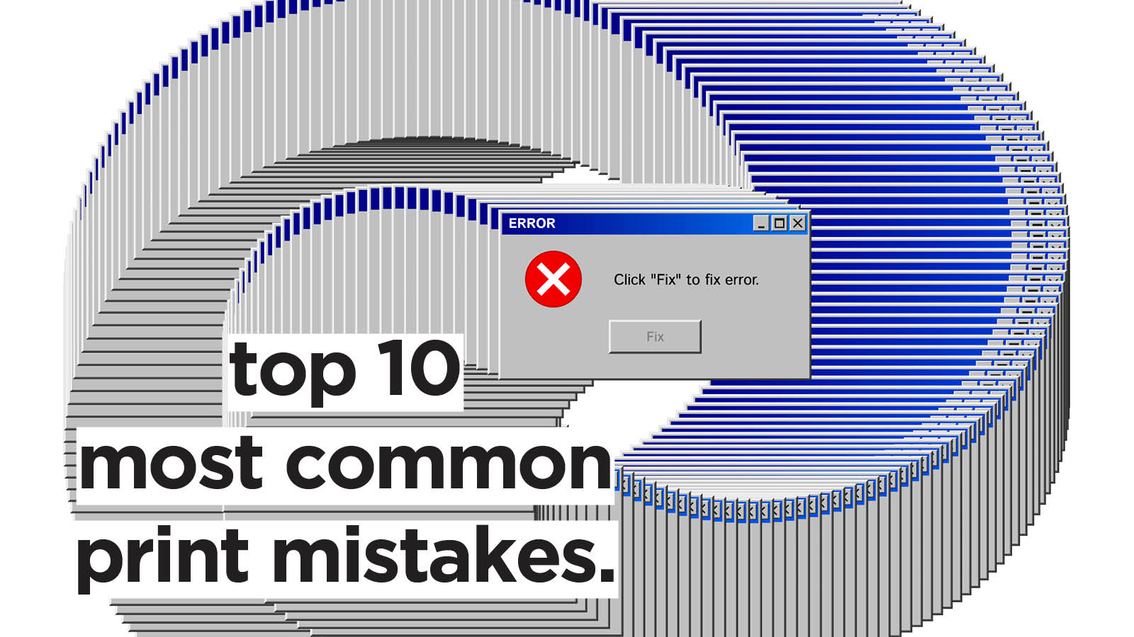
Designing for print is often treated as an extension of digital design—but in reality, it is a completely different discipline with its own logic, constraints, and technical rules. A design that looks flawless on screen can easily fall apart once it is printed: colors shift, text becomes unreadable, images blur, and layouts lose balance. These issues are rarely random. They usually come from predictable mistakes made during the design process.
Understanding these pitfalls is essential for anyone working with brochures, posters, packaging, books, or promotional materials. Below are the most common mistakes that ruin print results—and how to avoid them.
1. Designing in RGB Instead of CMYK
One of the most frequent and costly mistakes is designing print files in RGB color mode instead of CMYK.
RGB (Red, Green, Blue) is designed for screens. It produces bright, luminous colors because it relies on light. CMYK (Cyan, Magenta, Yellow, Black), on the other hand, is designed for ink and physical printing.
When a design created in RGB is converted to CMYK at the printing stage, colors often shift dramatically. Vibrant blues may turn dull, neon greens may become muddy, and overall contrast can be reduced.
Why it ruins results:
- Brand colors may not match expectations
- Images look less vibrant than intended
- Entire layouts lose visual impact
How to avoid it:
Always set your document to CMYK at the start of the project. If working in software like Adobe InDesign, Illustrator, or Photoshop, choose CMYK color mode immediately and use CMYK color profiles provided by your print supplier.
2. Ignoring Bleed and Safe Margins
Another critical mistake is forgetting bleed and safe margins.
Bleed is the extra space around your design that extends beyond the final trim size. It ensures that when the paper is cut, there are no unwanted white edges. Safe margins ensure that important content like text or logos is not too close to the edge.
Without proper bleed, even a tiny cutting shift can ruin the final product.
Why it ruins results:
- White edges appear around the design
- Text or logos get cut off
- Layout feels unbalanced or cramped
How to avoid it:
- Always add at least 3 mm bleed (or as required by your printer)
- Keep important elements at least 5–10 mm inside the trim area
- Use guides and templates provided by printing companies
3. Using Low-Resolution Images
Print demands much higher image quality than digital screens. A common mistake is using images downloaded from websites or optimized for web use.
Screen images are typically 72 DPI (dots per inch), while print requires at least 300 DPI for sharp results. Anything lower leads to pixelation and blurriness.
Why it ruins results:
- Images appear fuzzy or pixelated
- Professional quality is lost instantly
- Brand credibility is damaged
How to avoid it:
- Always use high-resolution images (300 DPI or higher)
- Avoid enlarging small images—they degrade quickly
- Use professional stock libraries or original photography for print materials
4. Poor Font Choices and Typography Errors
Typography plays a major role in print design, but it is often mishandled. Designers sometimes choose overly decorative fonts, forget to embed fonts, or ignore readability at small sizes.
Unlike digital design, print cannot rely on zooming or interactive scaling. What you print is what the reader gets.
Why it ruins results:
- Text becomes unreadable at small sizes
- Fonts may be substituted during printing
- Overly complex typography reduces clarity
How to avoid it:
- Stick to clean, legible fonts for body text
- Limit the number of fonts to 2–3 per design
- Always embed or outline fonts before sending files to print
- Test readability at actual print size, not screen zoom
5. Overusing Dark or Saturated Backgrounds
Dark backgrounds can look elegant on screen, but they are tricky in print. Ink behaves differently on paper, and large dark areas can appear uneven, smudged, or overly heavy.
Saturated backgrounds also increase ink usage, which can lead to drying issues or color inconsistencies.
Why it ruins results:
- Uneven ink coverage
- Higher printing costs
- Reduced readability of text on top
How to avoid it:
- Use dark backgrounds sparingly and strategically
- Ensure strong contrast between text and background
- Consult print proofs before finalizing heavy color designs
6. Not Proofing Colors with a Physical Sample
Screen calibration varies widely between devices. What looks perfect on your monitor may not match the final printed output.
Failing to request a proof (a test print sample) is a major risk, especially for brand-critical materials like packaging or marketing collateral.
Why it ruins results:
- Unexpected color shifts
- Brand inconsistency
- Expensive reprints
How to avoid it:
- Always request a printed proof for important projects
- Work with color-calibrated monitors
- Use Pantone or standardized color systems when precision is required
7. Overcrowded Layouts
In print design, space is not empty—it is functional. Beginners often try to fill every inch of the page with text, images, and graphics, thinking it adds value. In reality, overcrowding reduces clarity and visual hierarchy.
Why it ruins results:
- Information becomes hard to scan
- Design feels chaotic and unprofessional
- Key messages get lost
How to avoid it:
- Use white space intentionally
- Prioritize hierarchy: title, subtitle, body text
- Remove anything that does not serve a clear purpose
8. Incorrect File Setup and Export Settings
Even a well-designed file can fail if exported incorrectly. Common issues include wrong file formats, missing bleed, low-quality PDF settings, or unembedded images.
Printers typically require high-resolution PDFs with specific settings. Ignoring these leads to delays or unusable files.
Why it ruins results:
- Files may not open correctly at the print shop
- Images lose quality during export
- Layout shifts or fonts are replaced
How to avoid it:
- Export as PDF/X-1a or PDF/X-4 when required
- Embed all images and fonts
- Double-check export settings with your printer’s guidelines
9. Forgetting About Paper Type and Finishing
Print design does not end at the file stage. Paper choice and finishing techniques significantly affect the final look.
A glossy brochure, a matte business card, and a textured art book all behave differently with ink. Designing without considering material properties is a missed opportunity—and sometimes a failure point.
Why it ruins results:
- Colors appear differently than expected
- Ink may absorb unevenly
- Final product feels mismatched to design intent
How to avoid it:
- Discuss paper options with the printer early
- Request physical samples of paper types
- Adapt design choices (contrast, saturation, texture) accordingly
10. Skipping the Final Pre-Press Check
The pre-press stage is the last opportunity to catch errors before printing. Many designers rush this step or skip it entirely, leading to avoidable mistakes reaching production.
This stage includes checking alignment, spelling, image resolution, color mode, bleed, and file integrity.
Why it ruins results:
- Typos appear in final prints
- Layout errors become permanent
- Costly reprints are required
How to avoid it:
- Use a structured pre-press checklist
- Print a physical draft when possible
- Review files with a fresh perspective or a second pair of eyes
Conclusion
Print design is unforgiving—but that is also what makes it powerful. Unlike digital media, where errors can be fixed instantly, print requires precision from the very beginning. Most failures are not caused by lack of creativity, but by overlooked technical details.
Designers who master print fundamentals—color modes, resolution, typography, layout discipline, and production awareness—gain a significant advantage. Their work not only looks better on screen but also translates seamlessly into physical form.
In print, perfection is not optional. It is built step by step, long before ink ever touches paper.